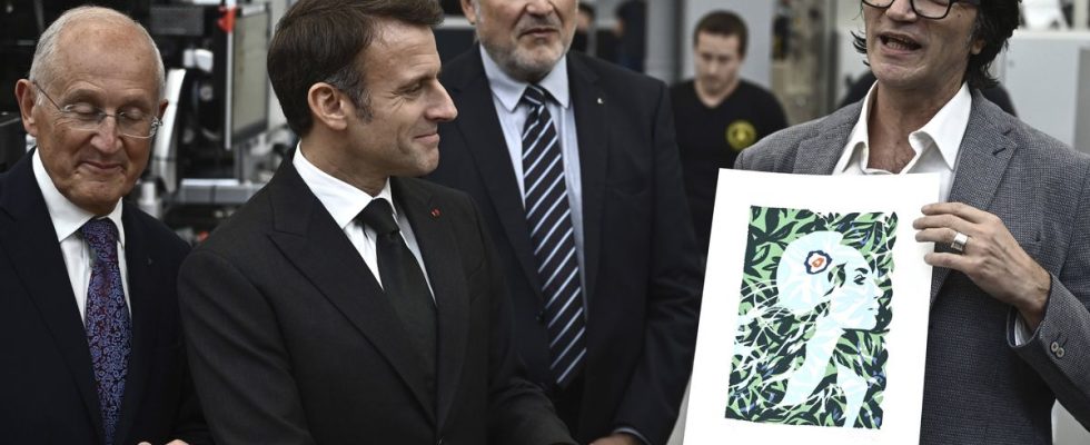
It’s brand new. But an error did not escape the vigilance of Internet users. La Poste, in the presence of Emmanuel Macron and French illustrator Olivier Balez, presented the new face of the stamp. We see the “Marianne of the future”, with a peaceful look, her hair blending into a vegetated area. Graphic designer Olivier Balez wanted to “participate in the story of the climate emergency without falling into something anxiety-provoking”.
Except that in the drawing presented by the artist, in color unlike the real stamp, the cockade on Marianne’s cap does not have the right colors. At least, they are reversed. While, from inside to outside, the correct order should be blue, white, red, here it is quite the opposite with red, white, blue. Or, the English cockade.
A false error
The Post Office defends itself. Questioned by many Internet users and contacted by 20 minutes, she explains that “the drawing presented yesterday in Boulazac was a personal gift from the artist to the attention of the President of the Republic. Its colors are not those of the stamp which is printed in monochrome. »Olivier Balez also justified his choice in the columns of Figaro, affirming that the color version of the drawing was produced “especially for the meeting with the President of the Republic without submitting it to those responsible for La Poste. These are the colors of the French flag. »
To put an end to all controversy, The voice of the North finally recalls that the cockade with blue on the outside also existed, and is also “one of the symbols of the first French Republic”.