
Gray takes on colors
Gray is at the crossroads of black and white and, like black and white, it is not quite a color… in theory! In the world of decoration, however, gray is endlessly available, and to choose the perfect shade, we pay the greatest attention to its undertones.

Pure gray is generally referred to as “stable” because it has the advantage of remaining strictly the same regardless of the exhibition of a piece and the brightness level. This type of gray is particularly appreciable in rooms intended for to relax and rest, because it creates a relaxing atmosphere. However, care is taken to adjust its intensity to the light level of the room, favoring a light to medium gray in a space lacking natural light.

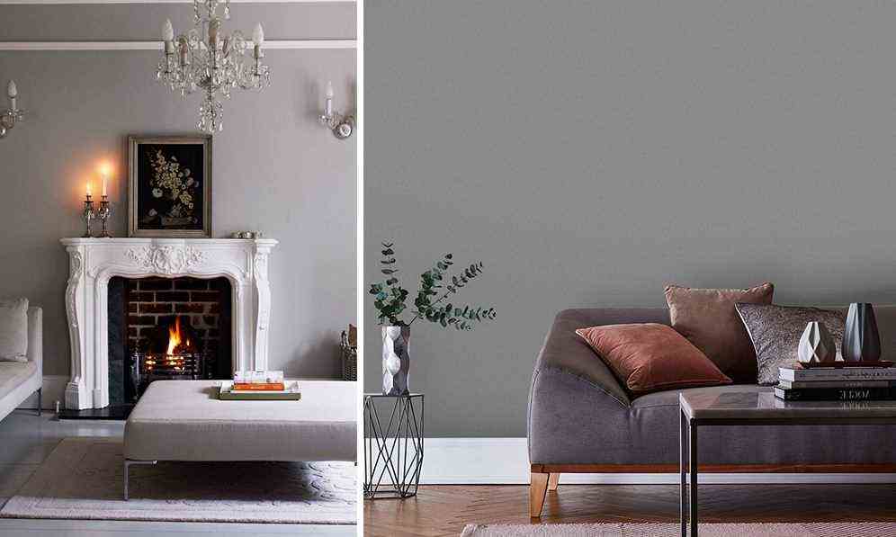
The authentic neutral gray sublimates the materials to perfection. It is therefore adopted in priority in the bedroom or in the living room, in association with the precious textiles, like silk and velvet. This gray highlights particularly well the materials which catch the light: we therefore fall for beautiful glass vases or for a metallic touch – favoring the silver color.

Neutral, but not too much: when gray is built on a base of red and blue, it is adorned with a very versatile character. Depending on the time of day and the exposure of the piece, it will reveal its red facet or its blue facet in turn… unless it flirts with the color lilac. Here is the dream shade for a contemporary boudoir spirit, in the bedroom or in the bathroom.

For a peaceful interior imbued with serenity, we put on a shade of gray drawing on beige. A touch of sun-kissed pigments is enough to create a cozy and warm atmosphere, which works in almost every room of the house.

The secret of a captivating interior, without being suffocating, is a deep gray, built on a blue base. We then dare the total look, by painting the wall and ceiling: a cozy cube effect, as effective in the bedroom or in the living room as in passage spaces, such as the hallway or the landing.
Gray, between sobriety and fantasy
Neutral color par excellence, gray is not without imagination. Timeless and elegant, it adapts to all your desires!

Feathers, natural stone or just wood: charcoal gray reveals the materials and puts them nicely in value. It is the shade of gray perfect for a very chic ethnic interior.

It is well known: at home, it is the entrance that sets the tone. This is all the more true when it opens onto the stairs, and, as an extension, onto the upstairs landing. For a simple and effective decoration, we put on the real mouse gray, a shade of gray which flirts without complex with the brown.

In the bathroom, we put on a warm gray of golden pigments in total look, associated with a touch of white. This soft and luminous palette offers a warm alternative to the traditional white bathroom.

Full of freshness, bluish gray brings a contemporary touch to a Villa which gives pride of place to exposed stones or to a stylish interior with fireplaces and moldings.

Irresistible, the terracotta-colored bedroom! To highlight this color between earth and fire, we choose a taupe gray, which tends slightly on an earthy brown.

Pastel gray is the preferred choice in a Scandinavian-style interior. This shade is largely self-sufficient, combined with a touch of white and light wood furniture. If you fall for the colorful interiors, you can safely associate it with other tender colors : pastel pink or mint green, among others.

In the children’s room, we fall for the association of a light and fresh bluish gray with a joyful touch of sun yellow. This type of gray allows more broadly all dynamic warm colors – such as red or orange.

Grey sublime all colors, up to the most demanding. We play it to stage saturated colors that flirt with the neon effect. These nuances which can sometimes seem difficult to handle then reveal all their delicacy.

For a elegant and airy decoration, we fall for a shade of gray green. Associated with a very mineral gray – here, on the floor of the room – it brings a real breath of fresh air. For balance the decor, we opt for earthy tones. In this stylish living room, we chose curtains in a sober and warm pink beige.