Apple founder Steve Jobs is reported to have taken a calligraphy course from a Trappist monk as a young student in Portland. The knowledge he gained about beauty and typography later flowed into the development of Mac computers and the design of the fonts available on them, he later told graduates of Stanford University. Job’s love of proportions and detail, along with the graphic abilities of the early Apple computers, was one of the reasons Apple became the darling of graphic artists and designers.
No calligraphy courses are known from Microsoft founder Bill Gates, no wonder, since products from this company are more functional than beautiful. Nevertheless, Microsoft’s office program Office was certainly more influential for the familiarity of fonts for millions of people. Just think of the “ugliest font in the world” decried Comic Sans. It was originally developed by Microsoft in the mid-1990s as a friendly alternative to the standard font Times New Roman at the time. It was actually intended for speech bubbles and cartoon characters. But then she did her mischief on countless funny PowerPoint slides, on office notices and birthday invitations.
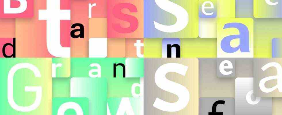
Calibri has been the standard font in Office since 2007, and after a good 15 years the sans serif and rather inconspicuous font is to be replaced next year. In a blog post did Microsoft introduced five new fonts, one of them should become the new standard font. They are called “Bierstadt”, “Grandview”, “Seaford”, “Skeena” and “Tenorite” and, like Calibri, are all sans serif fonts. Serifs are the small ticks and lines on individual letters. They are said to have their origin in ancient Greece because when chiseling letters it is easier to put a tick in the stone than to stop abruptly. Even today, longer texts with serif fonts in particular are considered to be easier to read.
However, computers and the Internet have made sans serif fonts such as Arial, Verdana, and Calibri popular. This is also due to the fact that the first monitors had a poor resolution and therefore detailed fonts with small ticks and feet could not be properly recognized and thus not easily legible. In the meantime, the sans serif fonts are seen by some as clearer and more modern, and by others as loveless or even soulless. When the company replaced its serif logo with a sans serif in 2015, Google sparked a debate in the feature pages about the fact that the “abolition of serifs is a cultural and historical commitment of the digital world to its radical capitalist nature”.
Microsoft intends to evaluate user feedback over the next few months
You don’t hear anything like that after Microsoft’s announcement that it would again introduce a new sans serif standard font for Office. Some of the five new fonts also take up well-known elements. According to its designer, Aaron Bell, the “Grandview” font, for example, is influenced by the spirit of the German industrial standard and classic German road and railroad signs.
For “Bierstadt”, designer Steve Matteson was inspired by mid-20th century Swiss typography, from the classic sans serif font Helvetica, which was developed in 1957. Bierstadt got its name from a rocky mountain in Colorado, which reminded Matteson of the Swiss Alps. For the lines of “Seaford” by Tobias Frere-Jones, Nina Stössinger and Fred-Writchras, pictures of old armchairs are said to have provided the template. The font should look like a beautiful family heirloom with durable upholstery for the reader and writer – but not plush or nostalgic.
Microsoft plans to evaluate user feedback on the new fonts over the next few months. This should be included in the decision as to which of these will be the future standard font.

