The advantages of blue
Blue is a cold color, which can evoke the sea or the sky. It comes in a remarkable variety of shades, from the iconic pastel blue of 1950s decoration to black blue, ideal for bringing depth to contemporary interiors. Peaceful color par excellence, blue seduces with its versatile character. With him, it’s very simple: it is almost impossible to miss. It is therefore the shade to be used as a priority to learn about the colored interior.
What shades of blue to choose?
Blue is an easy going color. But if it is simple, it is not simplistic, and the right choice of shades is enough to create a very specific decorative atmosphere.
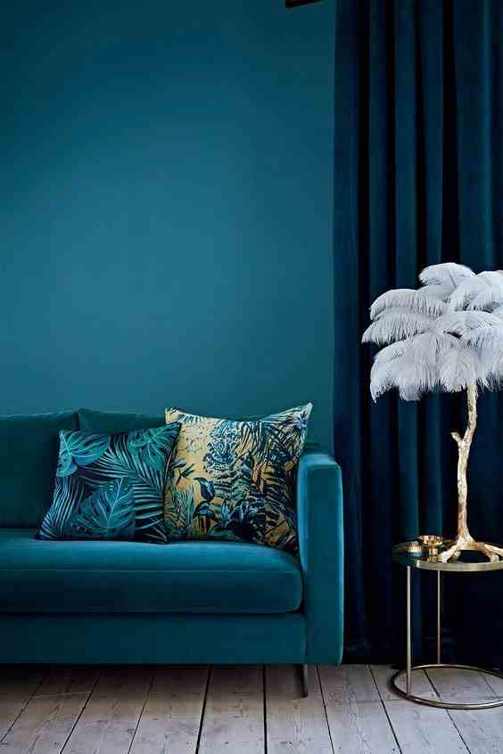
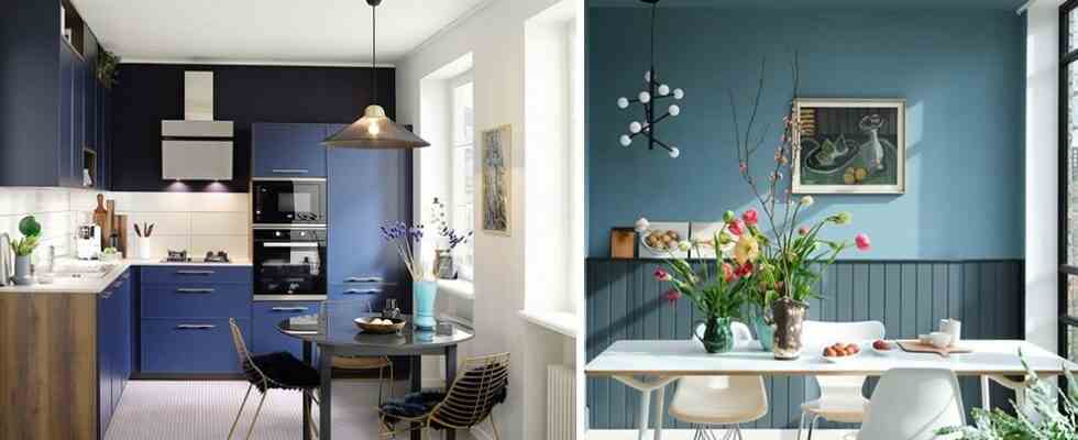
Deep aqua blues are among the most iconic shades of the neo Art Deco style. To adopt this look, bet on duck blue, in combination with its variants: peacock blue and petrol blue.
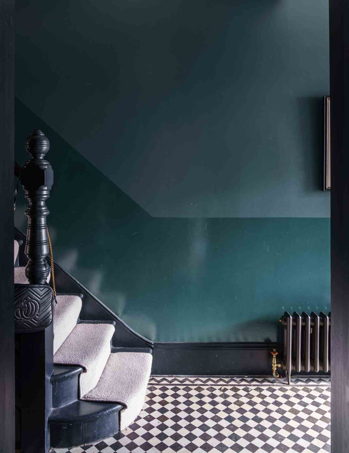
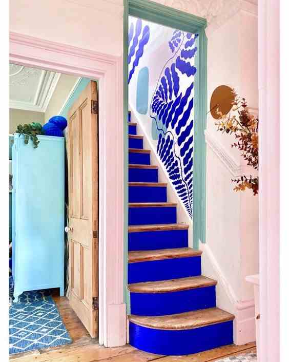
The particularity of aquatic blue is that it tends towards green. This gives it a great freshness. If you love hushed atmospheres, combine a deep blue-green with a midnight blue or an inky blue. This daring combination creates a cozy atmosphere, without ever being stuffy. Sublime in the bedroom or in the living room, it also gives personality to delicate spaces to decorate: stairs, landing or hallway.
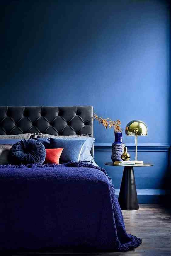
For an equally hushed, but more contemporary atmosphere, we put on the combination of inky blue and navy blue. These intense and elegant blues are also particularly soothing. They are excellent choices for the bedroom or for the bathroom.
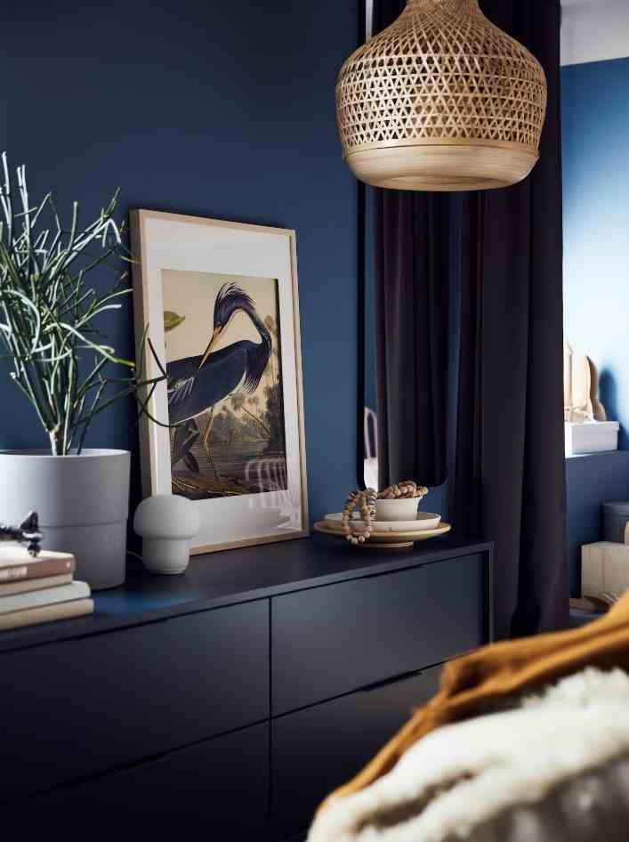
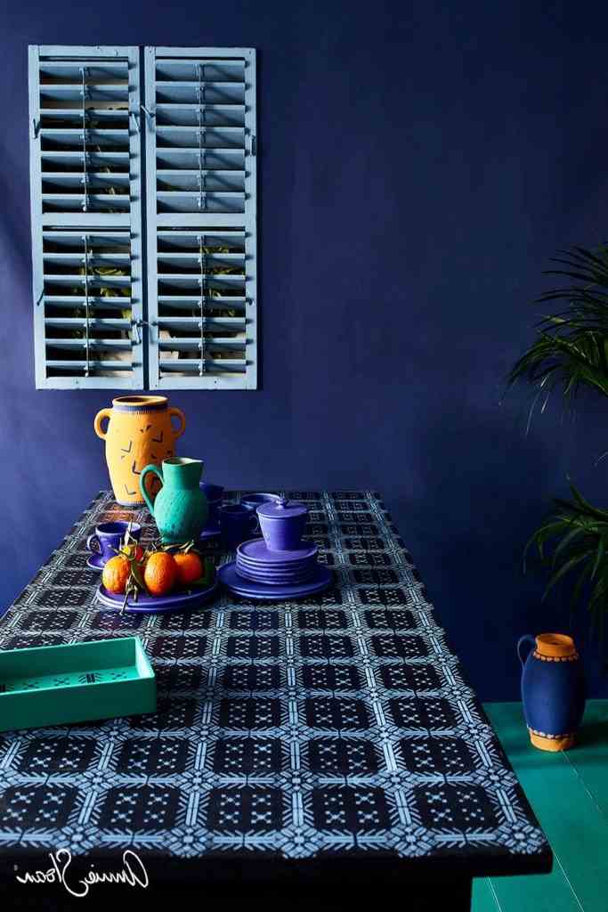
The combination of blue and black seduces with its chic and terribly sophisticated character. The alternative ? Combine inky blue or midnight blue with a black blue to create a softer contrast, yet full of character.
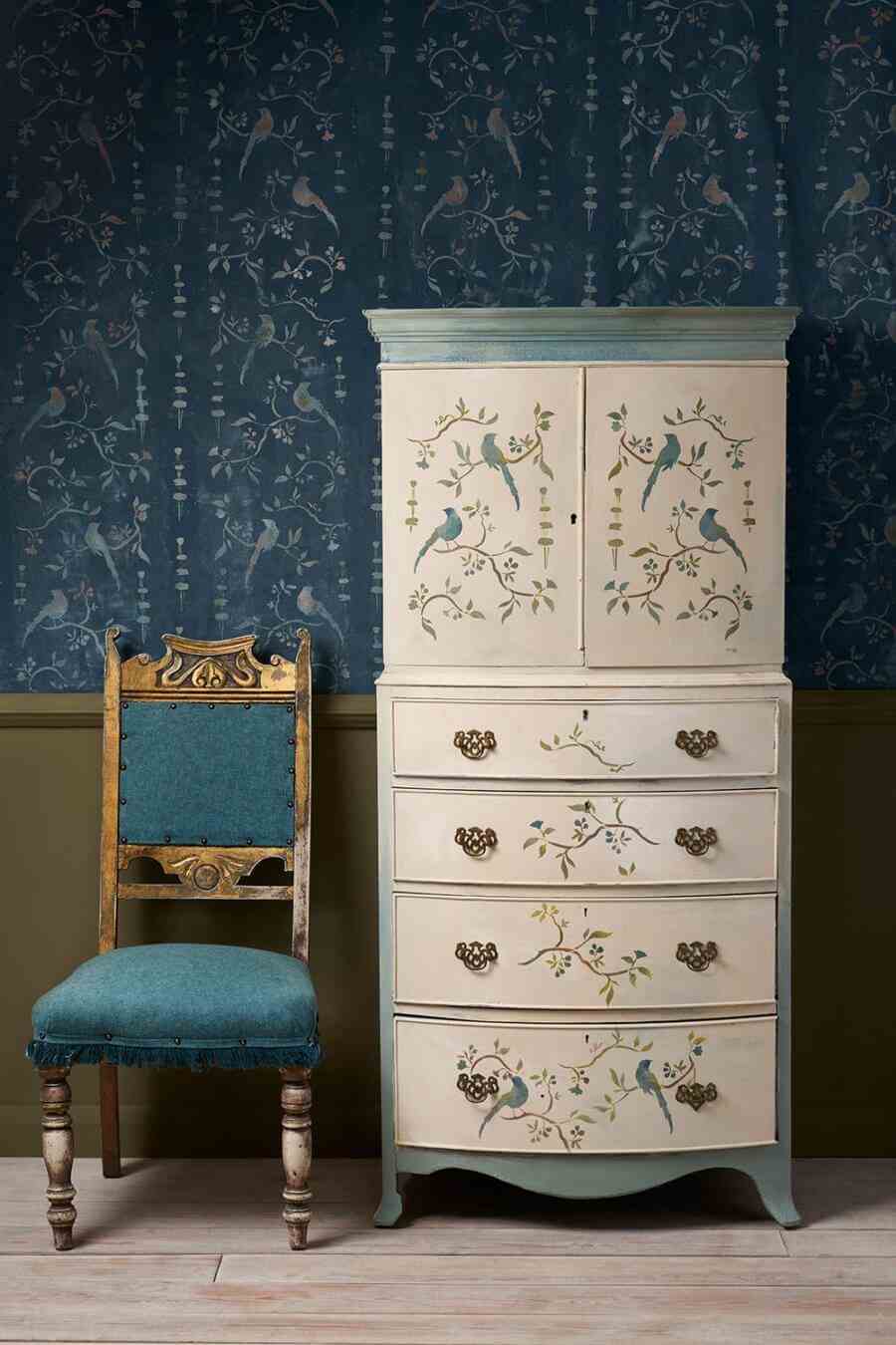
Whether light or darker, the slightly faded shades of blue exude an elegant, slightly vintage atmosphere. This type of association sublimates both a cottagecore or country chic interior and a Haussmann apartment.
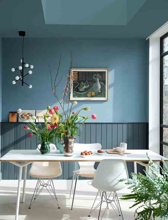
Blue being a cold color, you may hesitate to adopt the total look by combining several shades. The trick to creating a very cozy spirit at home is to bet on shades of gray blue. This muted touch softens the brightness, immediately creating a very cozy effect.
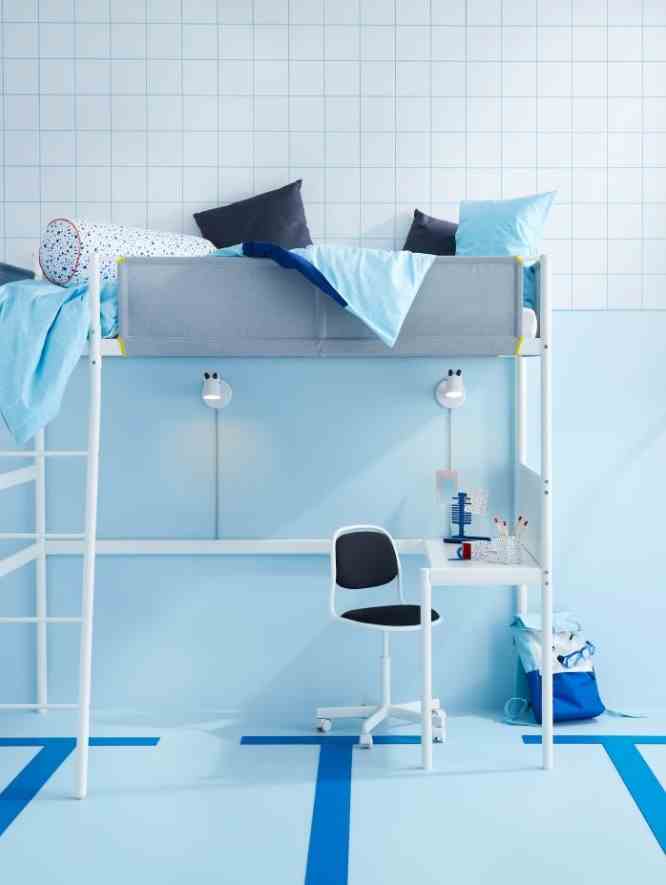
Pastel blue is one of the key colors in Nordic decoration. Used in total look, it has the particularity of being extremely cold. This facet is very interesting for adopting an ultra-contemporary, even high-tech decoration. To give it relief, it is associated with an inky blue or a cyan blue.
The sky blue creates a delightful contrast on a midnight blue or a navy blue. This duo is perfect for daring geometric, floral or ethnic patterns while maintaining a harmonious interior. We gladly play it in the Mediterranean interior.
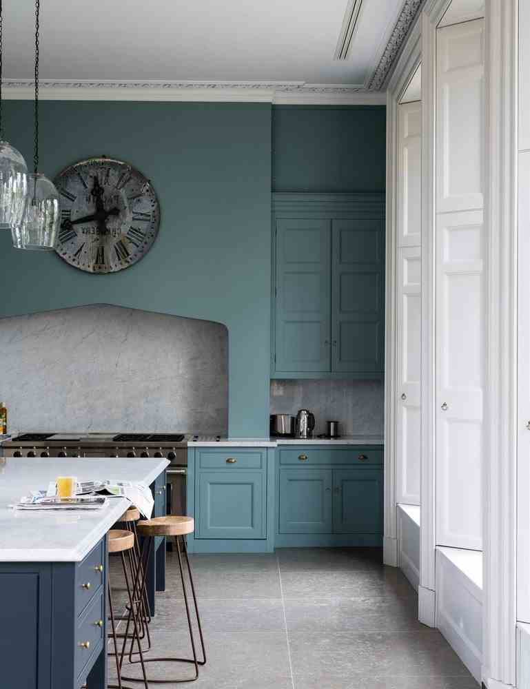
Do you fall for a specific shade of blue? It remains interesting to play on its intensity to give relief to the piece. In this very large vintage kitchen, we have adopted the essential gray blue in the medium version for the furniture, and chosen a slightly more intense version for the island.
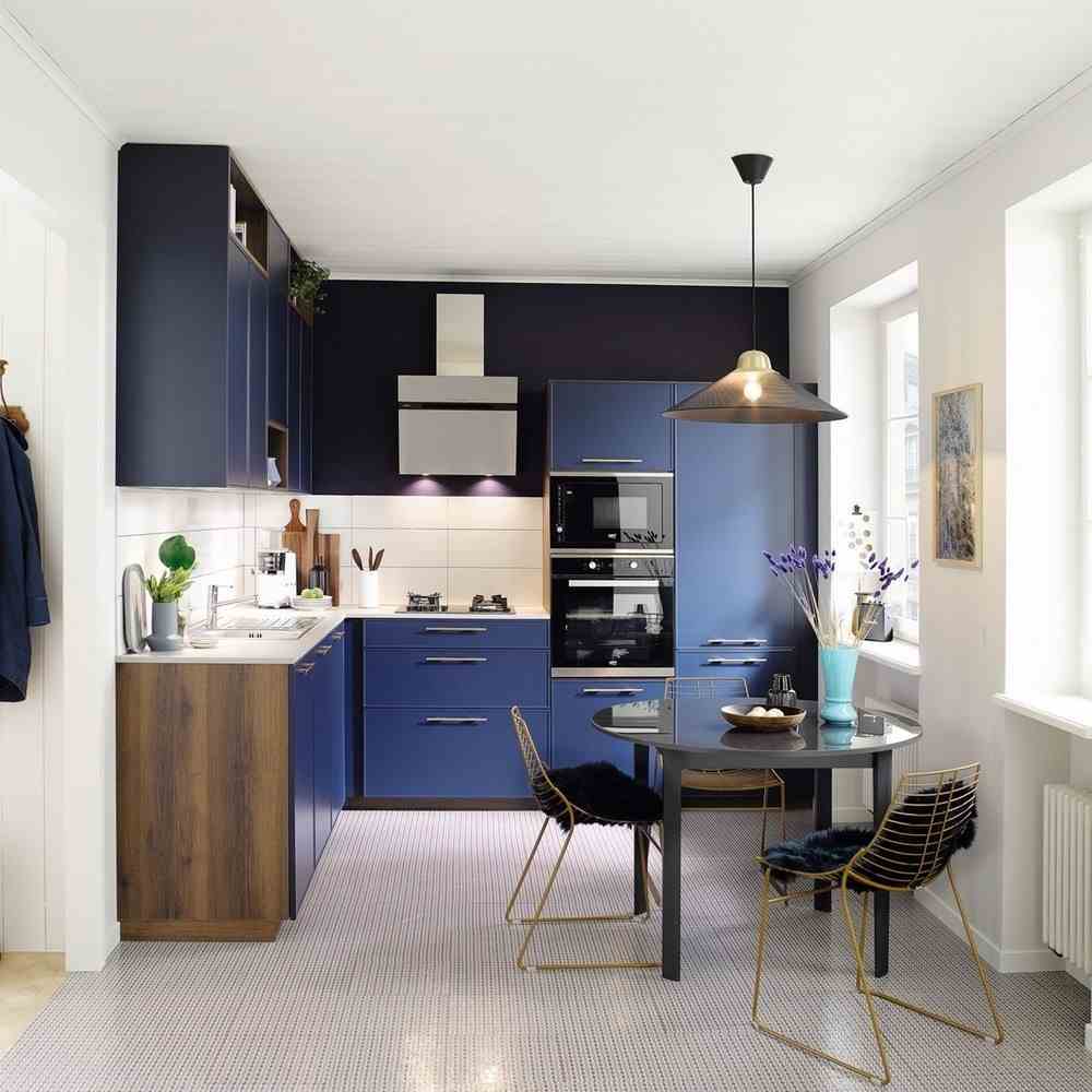
The game of shades is reversed in a small kitchen, where we adopt a wall and a credenza slightly darker than the furniture. This choice gives depth, which effectively helps to expand the room.
The combination of turquoise blue and navy blue is expected in a seaside spirit decor, which immediately takes on a tropical air. It also works perfectly in the bohemian gypsie-inspired interior, which is usually dominated by warm colors such as red or pink.
To create a powerful color impact, you can go for turquoise blue or Klein blue. In order to temper this strong color, associate it with a wise blue: very light sky blue or, on the contrary, midnight blue flirting with black.
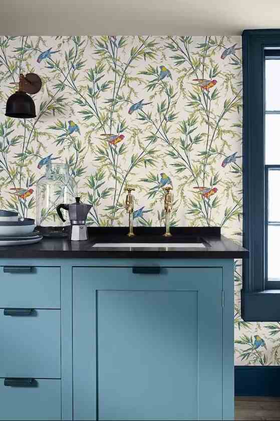
The secret to pairing two shades of blue is to make sure you create enough contrast between them. In this kitchen, we chose a medium blue for the island and a more intense shade for the window and the handles. The little extra? The wallpaper, on which we find these two shades. A trick that creates a very harmonious aesthetic in the room.
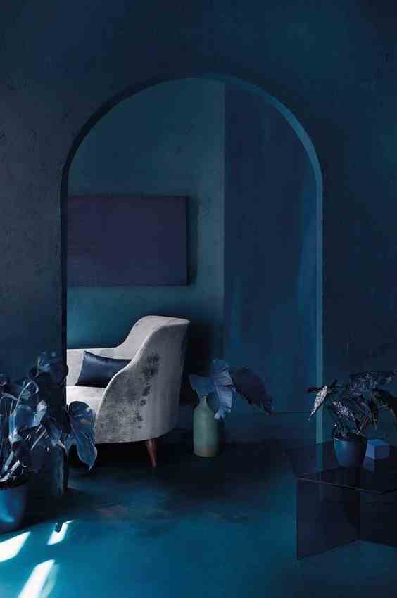
You can combine shades of blue with a softer contrast. This bias creates a beautiful optical effect, because it gives the impression of a luminosity which draws shadows in the room, which makes it possible to sublimate the volumes. Be careful with the total look, however, especially if you favor deep blues: this also creates a very pronounced nocturnal or underwater effect! For a similar effect, but more airy, favor shades of light blue.