1 – A grayish white for a soft and bright interior
For several seasons, the pure white is worth it. At a time when we love interiors imbued with softness, we criticize it for being too bright, and thus creating too pronounced contrasts. We therefore prefer the gray white, a much softer neutral.

In the attic, we refused to give up the luminosity of pure white. It was therefore purely and simply associated with a grayish white.

In total look or paired with a pure white ceiling, greyed white is an elegant choice in a country chic interior. It is the ideal shade for a white and wood kitchen with a friendly and soft atmosphere.

Beautifully sober, greyed white is a precious ally in a colorful interior. He created a contrast very soft with strong colors, and with it, you can even dare a touch of saturated color: lime green or lemon yellow.
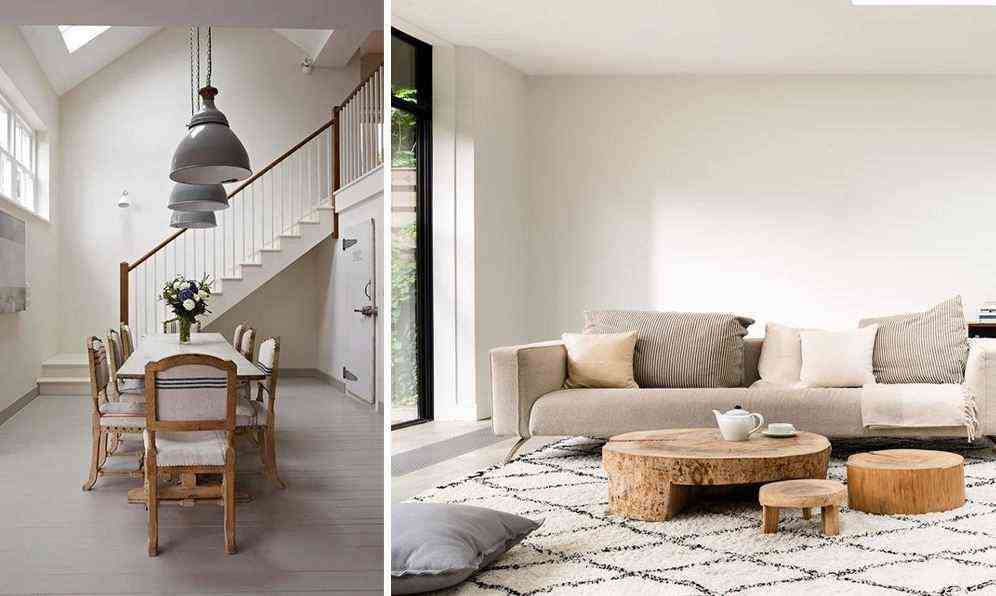
2 – A warm neutral white
Warmed up with a touch of yellow, white gains in elegance, but also in depth. It is used and abused, by declining it in pale or darker version, especially in a bohemian or Scandinavian interior.

In this cocooning lounge, we fell in love with a warm white shade on the woodwork, which harmoniously matches the ecru color of the walls. Very trendy terry sofa and faux fur rug: a skilful play of materials accentuates thecozy atmosphere of the room.
3 – A warm white tinted with red or orange
the White hot is not necessarily tinted with yellow pigments: it sometimes ignites with a red or orange note. Discreet and elegant, this type of shade is ideal for subtly adding a twist to an interior.

A triangle on the wall to create a cozy reading corner, a vertical strip to give the impression that the ceiling is higher or a vertical strip to visually expand the space… The trend is for colorful patterns on the walls, even on the floor! To succeed, there is no need to launch yourself into a riot of colors: a warm white gives you a very nice backdrop to let your imagination run free!

When it has a touch of red, white sublimates to perfection strong colors which are making a big comeback in our interiors: plum, purple or burgundy. It is also the perfect shade to sublimate a pale terracotta, another must-have color this season.
4 – A white with a hint of green
the white tinted green has the advantage of being at the same time soft, luminous and full of freshness. We recommend it particularly in rooms exposed to the south, where the natural light is warm and very intense.

In this chic country kitchen, we fell in love with shades of soft green very current: colors skilfully sublimated by the choice of a white with green undertones.
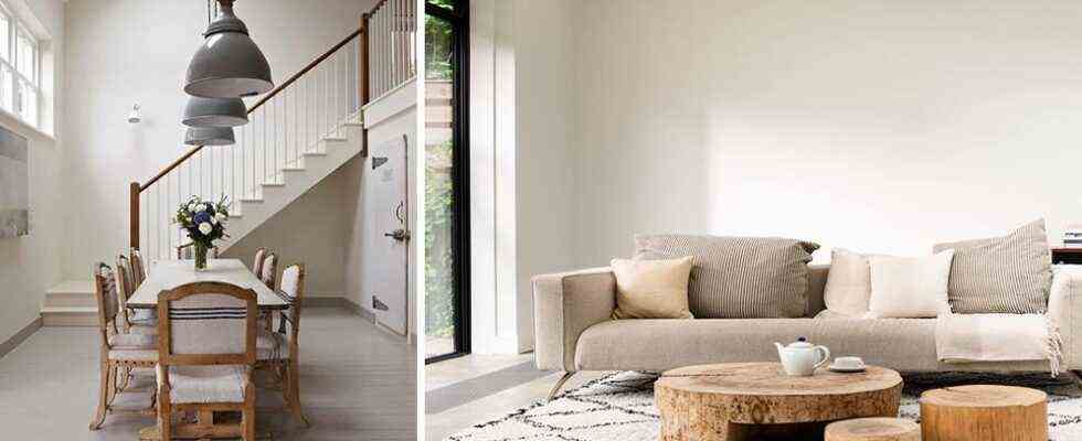
5 – A chalky white
If white is losing ground – especially compared to gray and the ecru color – there is one shade that remains very trendy: chalky white. White called “chalky” designates a shade of powdery off-white. Bright without being cold, this type of white works perfectly in large spaces, such as loft. For it to have its full effect, we pay attention to the finish, favoring thematt or velvet effect.

In this dining room that skilfully mixes country chic spirit and industrial inspiration, chalky white is combined with taupe-colored parquet: a well-found combination to create an atmosphere imbued with softness.
Tips for choosing your shade of white
White being the neutral color par excellence, it is still too common to choose it “haphazardly”. For a cozy and elegant interior, it is nevertheless advisable to choose your shade of white, taking into account in priority theexhibit of the piece.

The warm shades of white are recommended in rooms exposed to the east, while we will opt for a white tinted green or blue for a room facing south. Grayed-out white works well in a west facing room, which benefits from a warm and orange natural light. The use of white is traditionally discouraged in the north, where it takes on a grayish tint, unless it is associated with warm colors such as yellow.

If you go for a colorful interior and want to use white as a complement – for woodwork, the floor or the ceiling, for example – consider adapting your shade of white to your palette. A white with a touch of green is for example ideal in a harmony favoring sage green, mint green or celadon green.

To choose the right shade of white also allows the decoration to be discreetly balanced. In this small green kitchen not benefiting from a lot of natural light, we opted for a warm white, which makes the space warmer.
White is a much more complex color than it seems, so it is best to take the time to choose it well. Do not hesitate to carry out different tests using samples!