The particularities of powder pink
Powder pink is one of the delicate shades to define precisely. This pink tending to brown can in fact be more or less intense. Popular as one of the major color trends for 2024, it is coming into our interiors this year in a light, almost nude shade, or in more intense, but very muted shades.
Powder pink: the 5 most beautiful color combinations

The surest way to compose a harmonious palette is to combine two complementary colors. In the case of pink, we therefore opt for green. If powder pink goes well with almost all shades of green, it is particularly sublime with delicate shades such as sage green. This soft and bright duo has the particularity of working just as well in the kitchen as in the bedroom or living room.
Top in a Scandinavian atmosphere, the combination of powder pink and sage green has a very natural side, and we therefore dare to use this palette in an organic decoration. In terms of material, we rely on a very light type of wood, on rattan and on plant fibers, and on sober textiles such as cotton or linen.

Unlike baby pink, powder pink belongs to the warm color family. The fact that it tends towards brown, however, gives it a very wise character. It can therefore be associated with more saturated dynamic colors. It is particularly elegant with shades of orange that flirt with pink, such as coral or peach.
To stick with trends, we associate it for example with Peach Fuzz, the Pantone color of the year 2024. This warm palette can be completed with a touch of ocher yellow, or refreshed with a touch of ice blue. Although it works in the entrance, in the kitchen or in the living room, we particularly like it for warming up the bathroom.

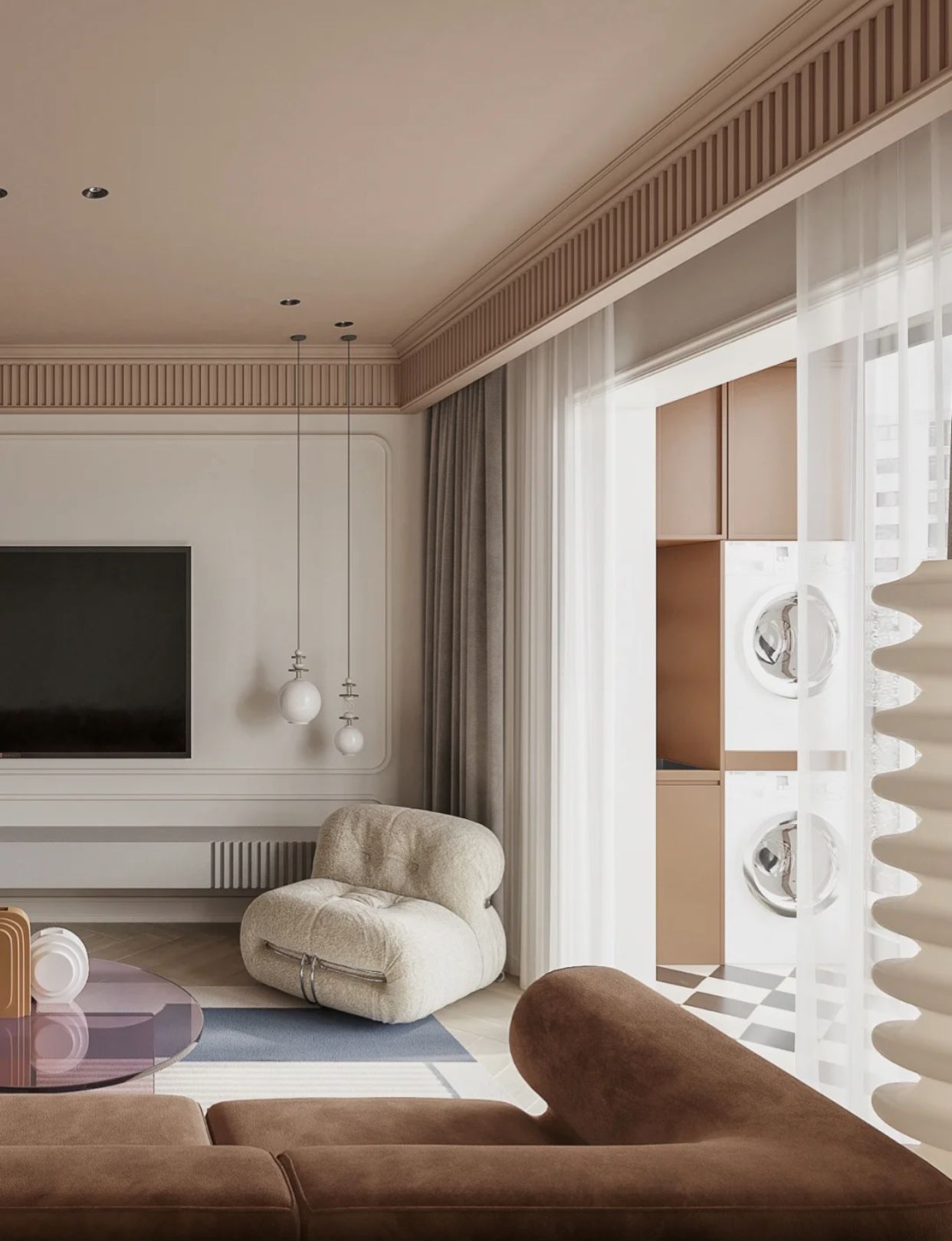
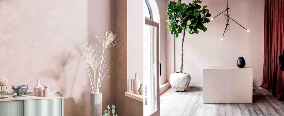
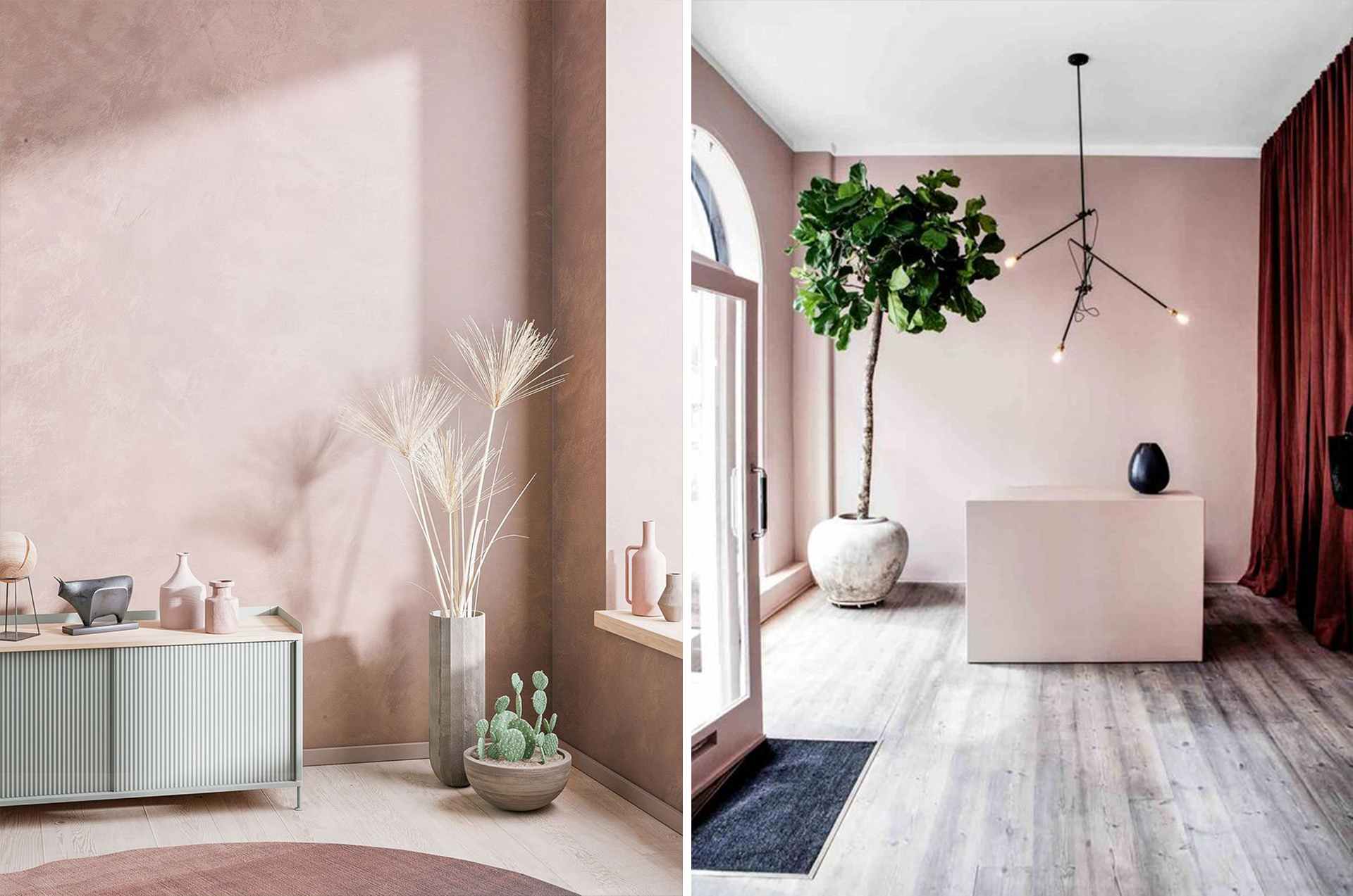
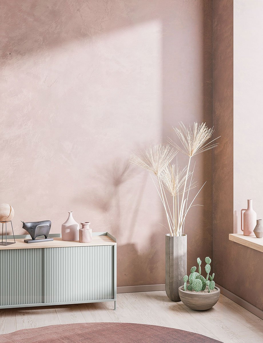
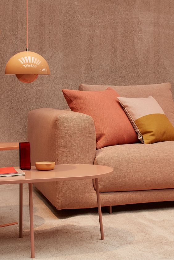
As powder pink tends to brown, it is hardly surprising that it goes harmoniously with all shades of brown. This tandem is rather smart for daring to use color at home, without risking bad taste. Powder pink and brown make up a sober, elegant and very contemporary palette, as sublime in a retro decoration as in a more minimalist decor.
The combination of the softness of pink and the reassuring character of brown creates a particularly relaxing atmosphere, ideal in the bedroom or living room. To accentuate this cozy spirit, we love cozy materials such as wool or velvet.
Pink and brown creating a warm atmosphere in the living room, we hasten to fall for a coffee table that sticks to 2024 trends by daring materials known to be cold, such as glass or travertine.

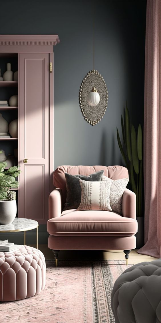
Powder pink is characterized by its delicacy. The best way to enhance it is to combine it with a muted color such as gray. To give character to the decor, we favor a characterful gray like pepper gray. This palette gently shakes up the codes, and it works just as well in a boudoir-style living room as in a very contemporary kitchen.
To adopt it, we play with the details, favoring a matte or velvety finish for the furniture and the walls. Want a glam look? Add a few touches of golden brass by playing with small furniture pieces or lighting fixtures. On the textile side, velvet works perfectly. If you fear a too “candy” effect, introduce some mineral touches: marble, terrazzo or cement.

Bold, the combination of pink and red! However, the tandem undeniably gives character to the decor. One of the safest ways to embrace it is to opt for earthy shades, such as powder pink and brick red. The duo works perfectly in a maximalist interior. With its strong personality, it appears just as stunning in an interior which is, on the contrary, very refined.
Powder pink and brick red, however, should preferably be reserved for specific spaces: they should be adopted in a large room with plenty of light. On the other hand, this duo can be a little too stuffy in a small room, especially if the ceiling is low, as well as in the case of a room facing south.