
The fresco of the year 2022
Graham & Brown belongs to the category of reference publishers. Just like Pantone and Dulux Valentine, the brand chooses a color of the year… except that at Graham & Brown, this color is accompanied by a wallpaper or a fresco. Of course, color and fresco are designed to combine perfectly.

Called “Restore”, the fresco of the year is designed to be associated with “Breathe”, a grayish blue which is reminiscent of Dulux Valentine’s Bleu Horizon.

Like every year, Graham & Brown offers different variations on the theme of its flagship motif. If Restore is available in a very modern dark green, it is difficult not to give in to the charm of the Midnight version. Taken in a darker blue, the fresco of the year reveals all its subtleties in this dark shade without being too deep.
Fable: the forest according to Graham & Brown
Driven by the chic countryside trend, forest wallpaper is making a comeback in the spotlight. With Fable, Graham & Brown signs a rather clever reinterpretation. Its secret: strong colors, which allow this pattern full of freshness to adapt to an astonishing variety of types of decoration.

Don’t be fooled by the name: the Fable Sage model is more whimsical than it looks. Because if it is a very fresh green which dominates, the colors tend discreetly, but surely towards very current acid colors.

We fall for Fable Mustard – a warm version that comes as its name suggests in a mustard yellow. This sunny background brings a real modernity to the pattern, and this wallpaper therefore adapts as well to a Scandinavian-inspired interior as to a modern decoration, to which it brings a little playful twist.

Fable Forest is without a doubt the most spectacular version of this print. Establishing itself as one of the most beautiful Graham & Brown 2022 wallpapers, it is perfect for bringing a touch of originality to a Mid Century inspired interior.
Eclipse: a simple pattern for a spectacular aesthetic
Graham & Brown has a special talent for making wallpapers with metallic finishes. The editor is playing more than ever with Eclipse, whose geometric pattern is inspired by the phases of the moon. As refined as it is spectacular, this wallpaper brings particular relief to all types of decor.

In order to have its effect, the Eclipse wallpaper needs to benefit from a little space. It will therefore be particularly popular in a minimalist interior, to which it suffices to add a luxurious touch, in particular in its black and gold version. This very Gatsby color also makes it the perfect ally of a neo Art Deco interior.

Eclipse wallpaper allows all daring. It is the ideal model to adopt the trend of the moment: the wallpaper on the ceiling – as an extension of the walls, of course. This type of pose creates an original aesthetic, even spectacular when the Eclipse print gets involved.
Night: the floral pattern gets a makeover
If there is one motif that blithely crosses the trends, it is the floral print. This year again, Graham & Brown reinterprets this classic with Nuit, a model that comes in very modern soft and powdery colors.

We particularly fall for the Lush model – an extremely versatile wallpaper that adapts particularly well to small spaces.

The most current, however, is undoubtedly the version called Sky Blue: a chalky white, a powdery pink, a grayish blue and a sage green… It declines discreetly, but surely, the most trendy colors of the year.
Asian inspiration
This year, a little air from Asia floats on the Graham & Brown wallpaper collection. The publisher has drawn inspiration from Japan, to design creations that are a bit retro and full of delicacy.

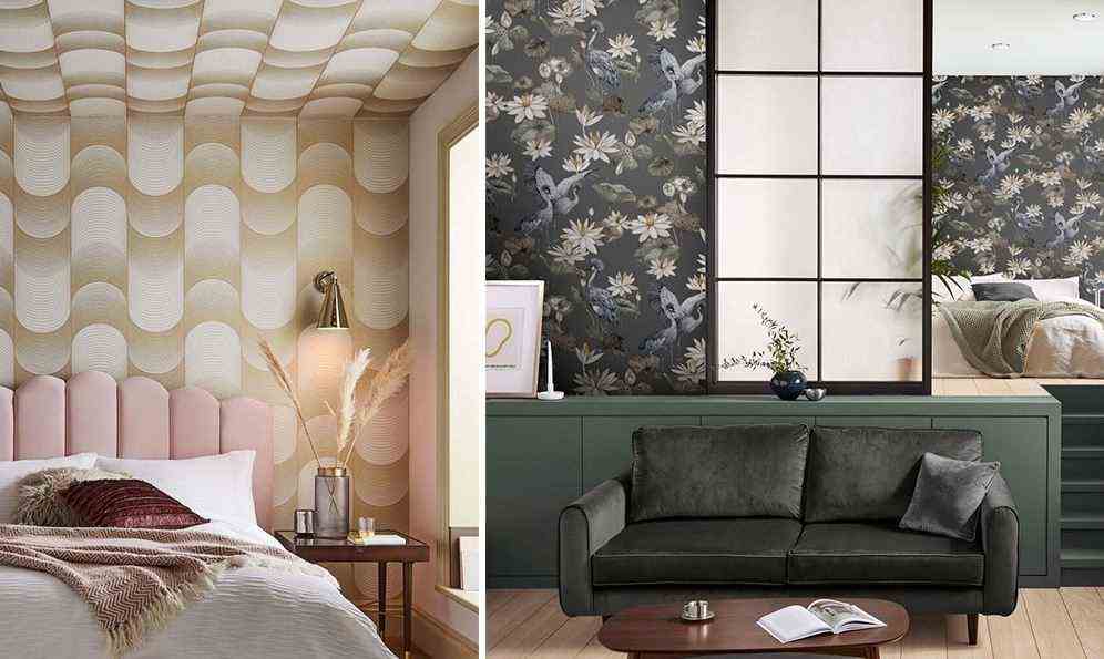
With Teien, your interior transports you to the heart of a secret garden nestled in the heart of Japan. And the color to shop is Tein Slate, easy to adapt with a palette of neutral colors. Lily pads and delicate cranes bloom against a warm gray background, in a very modern, earthy palette. This palette allows this inspired wallpaper to adapt just as well to a Mid Century decoration as to a contemporary or Japanese decoration.

If the pattern appeals to you, dare the Navy Blue version, which highlights it more. This variation – as sublime in the living room as in the bedroom or in the bathroom – allows many types of decoration. If it is allowed to dare the brass or gold decoration, you can also associate it with a raw wood and natural stone.

To design its Rendo wallpaper (“interlacing” in Japanese), Graham & Brown was inspired by a traditional pattern. This classic geometric pattern captivates with the keen eye for detail for which the color editor is known. Printed on a textured fibrous paper and enhanced with metallic details, Rendo is particularly striking in the Green & Copper version.