
1 – Choose a dominant color
To compose a harmonious palette, start by choosing a dominant color, which will guide you in the choice of the other colors. As the name suggests, the dominant color is the one that will become the strong shade – the most present.

The dominant color is frequently the one that dresses the walls – or at least the accent wall. Applied over such a large surface, it naturally sets the tone for the decor.

The dominant color can be used in large pieces of furniture: dresser, bookcase or kitchen furniture.
2 – Use the chromatic circle!
To combine two colors without taking any risk, the trick is to bet on complementary colors. You probably remember the basic complementary colors:
- Blue and orange;
- Purple and yellow;
- Green and red.
Depending on the nuance, however, these associations may vary. If in doubt, use a simple and effective tool: the color wheel.

To use it, it’s very simple, just locate a color that tempts you. The one directly opposite is its complementary color.
The use of the chromatic circle not only makes it possible to achieve a very reliable color association, but also to benefit from a perfectly balanced decoration.

The association of two complementary colors, it is indeed a fair balance between warm color and cold color. You will thus benefit from a decor full of character, which is neither stifling nor chilling, but perfectly cozy!
The use of complementary colors ensures a harmonious, but dynamic decor. For a softer colored interior, opt for a variant: associated colors.

The so-called “associated” colors are shades located side by side on the chromatic circle, like purple and blue. They combine naturally, without producing any pronounced contrast: the atmosphere of the room is thus imbued with serenity.
3 – Tame the hues, shades and values
To compose a harmonious palette, it is essential to take into account various elements:
- The tint ;
- The shade ;
- Intensity – or value.

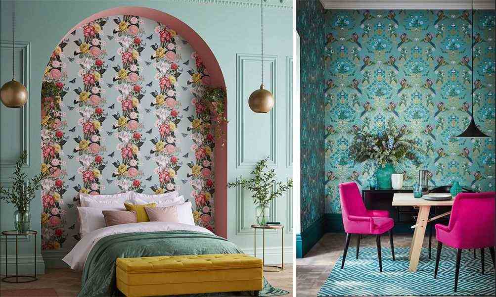
In this colorful dining room, we opted for a shade of blue, in a turquoise shade of medium intensity. To keep it high, we have associated it with a shade of pink, in a raspberry shade, of equal intensity.

In this monochrome living room, we used an identical shade of pink, available in different values - in other words, different levels of intensity. The lightest pink value is applied to the walls, in order to retain more light. This type of monochrome decoration creates a peaceful and sophisticated ambiance.
4 – Play with nuances and values!
Once you have grasped the different characteristics of a color, you can go daring and have fun composing more sophisticated palettes! Dare to use intense and dynamic shades, discreetly tempered by softer shades, or tender decorations enhanced with a touch of bright color.

Even a neon orange is gorgeous and very pleasing to the eye, when it unfolds against an ice blue, fresh and, above all, very soft!

A touch of bright color brings a little contemporary twist and relief to a pastel decoration.
5 – choose a common thread
Difficult, sometimes, to choose a colorful palette and stick to it! However, using a color as a common thread turns out to be rather smart! Do you imagine that a uniform decoration could be boring? You might have surprises! Because in reality, it creates a very peaceful and cozy atmosphere at home!

The choice of a dominant color is even smarter in the case of an open or semi-open kitchen, because it creates a visual harmony between the two spaces. Cocooning effect guaranteed!

The use of a color as a common thread has another very appreciable advantage in a studio or a small apartment: it allows the space to be visually enlarged.
6 – Respect the rule of three … or four!
In decoration as in fashion, we often hear that it is essential to apply the famous “rule of three”: no more than three colors in a single room. It is true that this makes it possible to achieve both joyful and harmonious palettes.

To create a palette of 3 harmonious colors, you can combine two primary colors and the secondary color they produce when mixed. In this chic country kitchen, we have associated yellow with green and blue. These two cold colors bring a breath of freshness, facing the walls of a warm yellow.

When composing your palette, consider the room in the house. Green in the bedroom? Canon! Especially when this cool color is balanced by two warmer colors, which create a cozy atmosphere.

In reality, the decoration allows some liberties with the rule of three, and it is possible to compose a completely harmonious palette by using 4 colors. If that scares you, go for a relatively light neutral shade: gray, taupe, white, beige or ecru.
7 – Choose your palette taking into account the light
To compose a harmonious palette, it is essential to take into account the orientation of the room.

In a room located to the north, it is important to compensate for the lack of natural light by favoring warm and light shades. If you opt for white, bet on a shade slightly warmed by red or yellow pigments. Beige or ecru are also welcome. In this clear frame, play with a touch of dynamic color, which will produce a harmonious contrast.

A room exposed to the east benefits from a moving light throughout the day. You can bet on cool colors, which you can associate with a warm shade, which will gain in intensity during the day. This is the occasion or never to use coral, which will reveal in turn its pink facet and its more orange facet.

In a room facing south, the light is intense – even brutal! Cool colors, chosen in a soft to medium intensity, are a great option for creating a serene atmosphere. You can compose a harmonious palette in monochrome, or combine them with neutral colors. Muted colors, like taupe and gray, are also very effective in calming things down.

The rooms exposed to the east benefit from a cold light – and the trick is to play with it. Go for green or blue, going for medium to deep shades. Use warm colors – yellow, orange or red – to keep the atmosphere pleasant.