Don’t worry, this year’s Whitney Biennial isn’t as bad as it looks. But it does make a poor first impression, and for a couple of reasons. One is that the works in the show, which is on view through September 5, are displayed indifferently. It requires some effort to bracket out the context into which they’ve been placed if you want to find their salient qualities; that’s because the biennial’s curators, David Breslin and Adrienne Edwards, have outsmarted themselves with a too-blatant installation gambit, which I’ll describe in a moment. But beyond that, many of the works included are what you might call interesting failures—and their failure tends to be more immediately apparent than what’s nonetheless interesting. (The opposite can also be true—an interesting failure can look, at first, better than it really is, exposing its weakness only upon further consideration—but this show mostly avoids that kind of seductive facility.)
Ultimately, the biennial’s problem is a sort of curatorial overreach. With the show mainly concentrated on the museum’s fifth and sixth floors, Breslin and Edwards have created two dramatically contrasting exhibition spaces, a black and a white one. The sixth floor is a concatenation of more or less enclosed spaces painted black, with black-carpeted floors, and they are filled with lots of works in black and white—black-and-white videos, black-and-white paintings, and so on. The fifth floor features traditionally white-painted perimeter walls but no interior walls, only freestanding partitions, also painted white. This is the floor where most of the show’s more colorful exhibits can be found. The openness of the fifth-floor space capitalizes on the flexibility and lightness of Renzo Piano’s architecture, but it introduces a new problem: The impression is rather like that of an art fair, and too many different things enter the viewer’s field of vision, competing for attention. Nor does one sense any special reason why certain works have been installed in proximity to each other; it’s as if the curators were asking us to pretend each artist’s work were in its own separate space, to be focused on exclusively, even while doing everything possible to make that kind of concentrated attention harder than it need be.
So the exhibition gets in the way of the art, perhaps because the curators want to be more like artists. Their effort to be creative in their efforts—and to shrug off the original aim of the recurrent show, which was conceived 90 years ago as, simply, a “comprehensive…exhibition in which the recent work of American artists may be seen under favorable circumstances”—may be evident even in the break with tradition represented by this year’s curators’ giving their show a thematic title, something that’s been done only once before, in 2006, when Chrissie Iles and Philippe Vergne dubbed the edition they curated “Day for Night,” à la François Truffaut. The title Edwards and Breslin have chosen is “Quiet as It’s Kept.” The phrase promises an intimation; it seems to offer to let us in on a secret. Among their acknowledged inspirations for the use of the phrase is the opening of Toni Morrison’s debut novel The Bluest Eye (1970), so it might be worth considering the great writer’s own reflections on it, from an essay she wrote as an afterword to a later reprint of the book: She gave the phrase to her narrator, Morrison explained, because “in addition to its ‘back fence’ connotations, its suggestion of illicit gossip, of thrilling revelation, there is also, in the ‘whisper,’ the assumption (on the part of the reader) that the teller is on the inside, knows something others do not, and is going to be generous with this privileged information.”
Well, museum curators should be in the know about what’s going on in the art world, and their inside information ought to be worth sharing. In one sense, Edwards and Breslin make good on that assumption: While many of the artists they’ve chosen will be familiar to denizens of the New York art scene—Ellen Gallagher or Charles Ray, for instance—relatively few are likely to ring a bell with a broader public. And then there’s plenty of work that will be new even to assiduous gallery-goers. Often these artists live and work at a distance from the main organs of the contemporary art scene. Among those whose work or even names I had not previously encountered: Pao Houa Her, a Laotian-born resident of Minnesota who uses different, sometimes incompatible photographic idioms to explore, as she says, “how the international Hmong community makes and remakes our collective memory”; Awilda Sterling-Duprey, a native of San Juan, Puerto Rico, who makes abstract drawings—a video playing alongside them shows the improvisational dance she does while listening to music, blindfolded—with inspirations as various as Yoruba philosophy and the ideas of John Cage; and Duane Linklater, a Canadian First Nations artist living in North Bay, Ontario, whose abstract paintings hang loosely from cords rather than on the wall, and have been made using such things as cochineal, orange pekoe tea, and blueberry dye, and who “works with patterns used for teepee covers.” A similarly freewheeling approach to abstraction—paintings (or at least, in the artist’s words, “they live nearish to paintings as their questions are relational”) executed in materials such as crayon, indigo, and Vaseline on leather—is found in the work of Rindon Johnson, an African American whose base in Berlin perhaps connotes a closer connection to typical art-world circuits; but still, Germany is not the first place you’d go looking for new American art.
All of which is to say that Edwards and Breslin have kept their eyes open beyond the usual places. That’s as it should be. Still, their show left me with the impression that their explorations had more to do with confirming or illustrating their own intuitions rather than opening themselves in a more radical way to what artists have actually been doing. Maybe the curators should have exercised more caution with the phrase “quiet as it’s kept,” remembering that in Morrison’s novel the child narrator is merely mimicking the adults’ knowingness—maybe she doesn’t know as much as she imagines.
In any case, the curators’ good intentions remain in part unfulfilled. So much of what’s on display in the show is visually inert, and some excellent artists are represented here by work that doesn’t show them at their best. But more than that, the works have been installed in ways that seem to ignore their specific character. If curators want to be artists, they should understand that the art of exhibition-making lies above all in creating connections among works that bring out their inherent qualities more clearly through constellations that suggest new meanings. In other words, the task of curating is to illustrate how different pieces relate to each other, in order to bring something new to them and to find something essential in them that might otherwise have been overlooked. It’s not easy to do that; it takes a lot of sensitivity and insight. Breslin and Edwards have shortchanged this side of the curator’s labor and placed more emphasis on their high-concept formula for fitting the works they’ve chosen into the space.
The dark enclosures of the sixth floor are perfect for video projections, and most of the show’s works in that medium can be found there. Among them is the biennial’s out-and-out masterpiece, Adam Pendleton’s Ruby Nell Sales (2020–22). This hour-long portrait of an elder in the movement for civil rights somehow manages to feel at once deeply intimate—what I carry with me above all from the piece are the memories of extreme close-ups of Sales’s face, with its sublime sense of inner calm and determination despite everything she has had to struggle against in a long life of activism—and implicitly conscious of how political the personal really is. Beautifully edited and paced, the work has more in common with documentary cinema than with most video art, which is perhaps just another way of saying that it would benefit from being seen in the conditions offered by a movie theater or screening room rather than in a black-box gallery space with benches. But it was so visually and emotionally engaging that, despite an innately restless disposition, I found it easy to sit through the whole length of it, and I suggest that in visiting the biennial, you allow yourself the time to do the same.
Other sixth-floor video works remain closer to the non-narrative and non-discursive conventions of gallery-based moving-image art. In Dave McKenzie’s two-channel projection Listed Under Accessories (2022), for instance, we see the artist moving—half-dancing, half-wrestling—with a pane of glass that’s a bit too large to handle without awkwardness. It’s very clearly in the lineage of 1970s task-based video works by artists such as Joan Jonas or Bruce Nauman, in which mundane movements or activities are given an intensity of focus that renders them ritualistic, absurd, or both; McKenzie brings to it a grace and deadpan wit that make his art-historical self-consciousness seem an inspiration rather than a burden, not unlike the difficult and fragile object with which he does his pas de deux.
Coco Fusco offers a disquieting yet strangely consoling vision of mortality in Your Eyes Will Be an Empty Word (2021). Like McKenzie, she follows the video art tradition of putting the artist herself at the center of the work—what led Rosalind Krauss, back in the day, to propose that “the medium of video is narcissism.” But Fusco positions herself neither as protagonist nor witness. Her subject is melancholy—we see her rowing a small boat around Hart Island, a potter’s field in Long Island Sound where millions of New York’s indigent rest, their burials having been performed, until recently, by Rikers Island prison inmates—but somehow the peacefulness of the open water, the rocking movement of the waves, the brilliance of the light reflecting off them, offer a kind of somber comfort. “Death will come and have your eyes,” intones the voiceover—the line is from a bitter poem by Cesare Pavese, one found in his desk after his suicide in 1950—but death’s horror is kept at a distance by the beauty of the Sound and the island itself.
But such moments, in which the complexities of mixed feelings are allowed to develop, are all too rare in this show. And there are some signal disappointments, with renowned artists presenting work that’s not up to their usual level. An example is Alfredo Jaar’s video installation 06.01.2020 18.39 (2022), consisting of a clip of the protest in Lafayette Park in Washington, D.C., following the murder of George Floyd. Jaar uses fans to replicate the fierce wind and loud noise produced by the helicopters that police used (along with tear gas and the like) to intimidate the demonstrators—but what was intended, presumably, to conjure a more vivid and immediate experience of the protest turns out more like a fun house special effect. Likewise, a series of large-scale photographs in which Daniel Joseph Martinez shows himself made up as the alien or monstrous characters from films like Werner Herzog’s 1979 remake Nosferatu the Vampyre and TV series like The X-Files does not adequately “bear witness to the extraordinary moment in human history, our own self-destruction,” as we read in the wall text; it merely replicates the grotesque entertainments on which the images are modeled. And the cinematic illusionism invested in the transformation of the artist’s visage is so complete that it’s only the label that lets you in on the joke that these are a sort of self-portraiture.
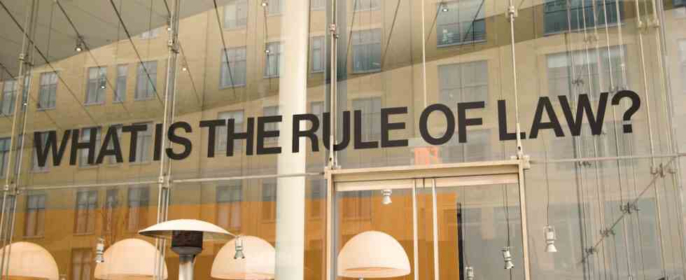
When I said, in the beginning, that the biennial isn’t as bad as it looks, I was thinking in part of works like those of Martinez—ones that have a rationale that turns out to be more intriguing than the resulting object, image, or text. An even better example of this might be Rayyane Tabet’s 100 Civics Questions (2022), which are scattered throughout the museum, inside and out. I felt somehow insulted by the questions, things like what did the emancipation proclamation do? or when do we celebrate independence day? or during the cold war, what was the main concern of the united states? why? I guess because seeing such questions in this context, I felt I was being invited to propose cynical answers, which is what, in my experience, the art world tends to mistake for “think[ing] critically about concepts like citizenship and nationality,” as the museum says this work invites us to do. “There’s something insidious in encountering the question ‘What is the Rule of Law?’ written on the Whitney’s façade,” Tabet observes in the catalog. Indeed, but it’s obvious and heavy-handed, not unlike Jaar’s fans or Martinez’s extreme makeover. But I got more interested in the piece when I noticed the label explaining that Tabet, who was born in Beirut, is presently applying to become a US citizen, and that these questions are taken directly from the naturalization test for which he is studying. Knowing this suddenly put me on the side of the artist, realizing that he is as oppressed by these questions (and their implicit “right” answers) as I am—though I still don’t appreciate being on the receiving end of such blunt demands.
In her catalog essay, Edwards asserts that “abstraction offers in a durational fashion everything representation obscures,” shrewdly overturning the received wisdom that representational art reveals things that abstraction obfuscates. And given the enthusiasm that curators and collectors have, in recent years, shown for figurative painting—often with an accent on topical subject matter over pictorial quality—the attention to abstraction is one of the most refreshing aspects of this biennial. I’ve already mentioned Rindon Johnson, Duane Linklater, and Awilda Sterling-Duprey, all artists whose work is, to use Johnson’s word, nearish to painting, and in an abstract mode. Pendleton, too, should be mentioned here, not only as a video maker but also as a painter; his black-and-white works seem to channel Abstract Expressionism and graffiti all at once as they explore the cusp between writing and gesture. Two distinct groups of work by James Little (a senior figure whose work has received less attention than it should) are present: In the blackened space of the sixth floor are black-on-black (or rather dark-gray-on-black) paintings of stripe patterns, while downstairs the fifth floor hosts works in which a layer of thick white paint, punctuated by roughly circular or oval “windows,” has been laid over a multicolored ground. I found the latter more mysterious and intriguing, while the dark paintings seemed swallowed up by their dark surroundings.
Not all the abstraction here is painting, however. Veronica Ryan’s sculptural array Between a Rock and a Hard Place (2022) comprises a multitude of small and large objects made out of everyday materials—sacks filled with empty plastic bottles, for instance, as if bundled for recycling; some hang from the wall, others sit on the floor, and still others are set on jerry-built racks. The piece makes me think about gathering and arranging as materialized thought processes, a sort of rumination-by-doing. And the humble nature of both the materials and the processes involved only underlines that the work is about something elusive—perhaps the “pathos” that Ryan says she wants “to be apparent in the work.”
It might seem perverse, but although I’ve already registered my reservations about this year’s biennial, I’m going to end by complaining about some of the most interesting things in the show. I quoted, earlier on, the Whitney’s original aspiration for its biennials to show “the recent work of American artists…under favorable circumstances.” I’ve explained why I think this biennial fails to offer favorable circumstances for viewing; I can only applaud the expansive understanding of what kind of artists belong in such a show, including immigrants as well as residents of our neighboring countries, Canada and Mexico. But why hasn’t the biennial been able to remain an exhibition of new art—ideally, work produced in the two years (or in this case, thanks to Covid-19, three years) since the last edition? (This is the same complaint I’d have lodged against MoMA PS1’s recent “Greater New York 2021,” which also seemed too imbued with nostalgia for the 1970s and ’80s to pay proper attention to the present.)
This part of the biennial’s remit has for years been honored in the breach rather than the observance, but I increasingly see it as a disservice to today’s artists. Don’t get me wrong: Some of the most fascinating things in the show come from decades past. What a thrill to discover a sequence of poem-drawings by N.H. Pritchard, the remarkable African American poet and mystic whose work has only recently come back into focus after remaining out of print for decades. And it was great to see a sort of mini-exhibition within the exhibition devoted to the work of Theresa Hak Kyung Cha, the Korean American conceptual artist, filmmaker, and writer; her unclassifiable book Dictee, published in 1982, the year she was raped and murdered in New York, is still a talisman for the radical reinvention of literary language, but her recalcitrant drawings, photographs, films, and videos should be more widely known. But wouldn’t this have been more readily accomplished by a full-blown, stand-alone exhibition? The same could be said about what, for me, was the most congenial section of the biennial: the installation of material from A Gathering of the Tribes, the magazine and cultural center that poet Steve Cannon founded in his East Village apartment in the 1990s and kept going until 2014—mainly memorabilia and ephemera of various sorts, as well as Cannon’s library, but also art by his friend David Hammons and drawings created by Cannon himself, despite his blindness. Again, I can imagine a bigger version of this installation being exhibited on its own, rather than functioning as a kind of chill-out space amid the sixth floor’s nocturnal atmosphere.
Not all the revivals in this biennial were so exciting. I didn’t see the point in remaking a Jason Rhoades installation from 2000 in this context. It looks like a period piece, not a fresh discovery. But in any case, if the Whitney considers all these works to be of present relevance, it should devote specific exhibitions to them and make room in the biennial for more of the art that’s being produced right now—the mission that should distinguish it from the museum’s other activities: an exploration of the present.