
The peculiarities of green
Green is of course associated with nature, and more specifically with the plant kingdom. It symbolizes spring, youth and renewal.
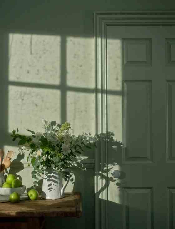
Just as fresh as blue, but more invigorating, green is the color of serenity. It therefore works perfectly in spaces dedicated to relaxation, such as the bathroom or the bedroom. However, it is quite cheerful for living rooms such as the kitchen – this season, the water green kitchen is also top trend. And it can be adopted just as easily in passageways such as the hallway or the entrance.
However, green has a particularity that must be taken into account: it has a real impact on luminosity. So, if you want to compose a shades of green in the bathroom, you have to take care of the lighting, otherwise you will look bad in the mirror.
By combining two or more greens, you create a very cold palette. It is ideal for bringing freshness to a room bathed in natural light and facing south. On the other hand, it will be avoided in the north.
The trick to enjoying the freshness of a palette made up of different shades of green while enjoying a cozy interior? Choose in priority smoky greens, which include a touch of gray: this is enough to temper the brightness and soften the atmosphere.
Combine greens in decoration: good ideas
In decoration, we rely on a combination of shades of green mainly to create a very natural aesthetic – for example in a decoration with a jungle or tropical spirit. But it’s far from your only option!
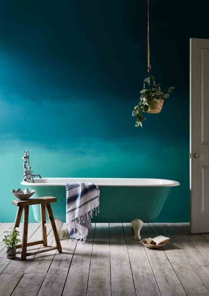
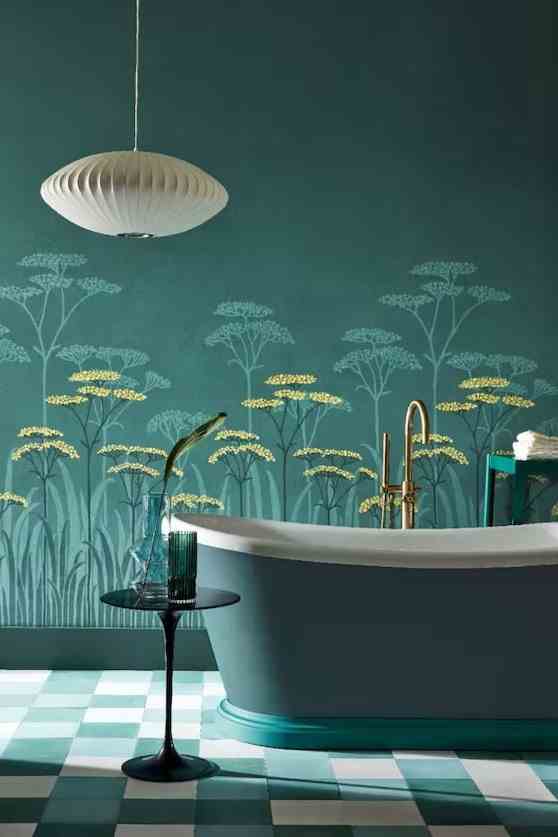
Aquatic greens are very interesting in decoration, especially to revive a vintage decor or in a neo art deco interior. Evoking water – a natural element – they also have a precious facet, which you can also highlight by combining them with emerald green or turquoise green. To sublimate them, don’t hesitate to try a shaded or tie & dye type effect.
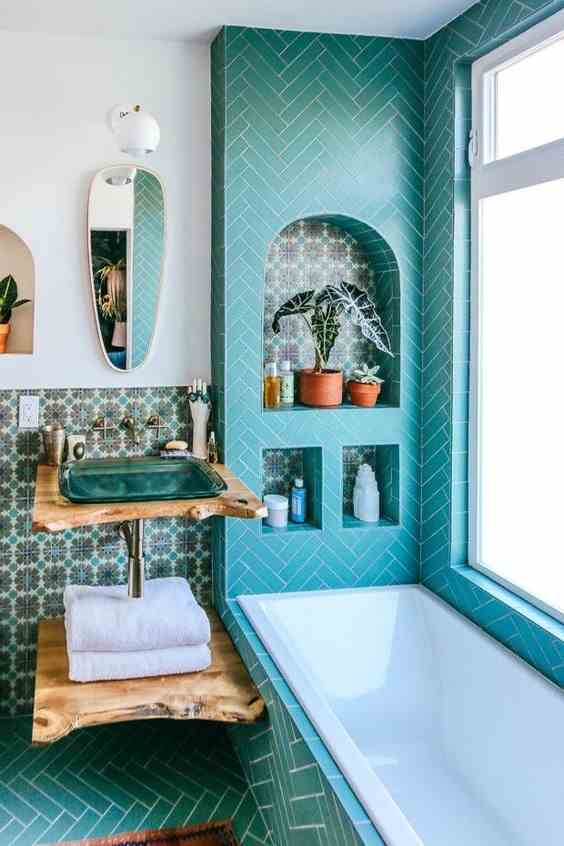
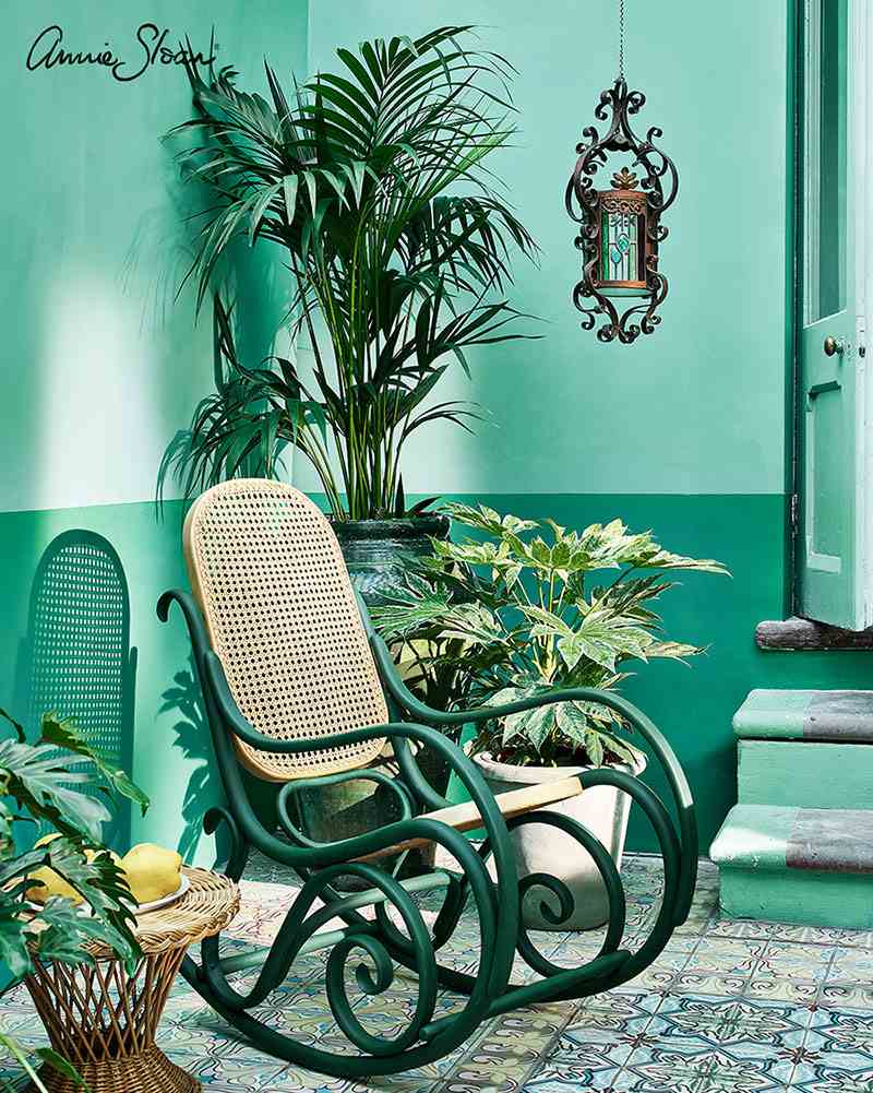
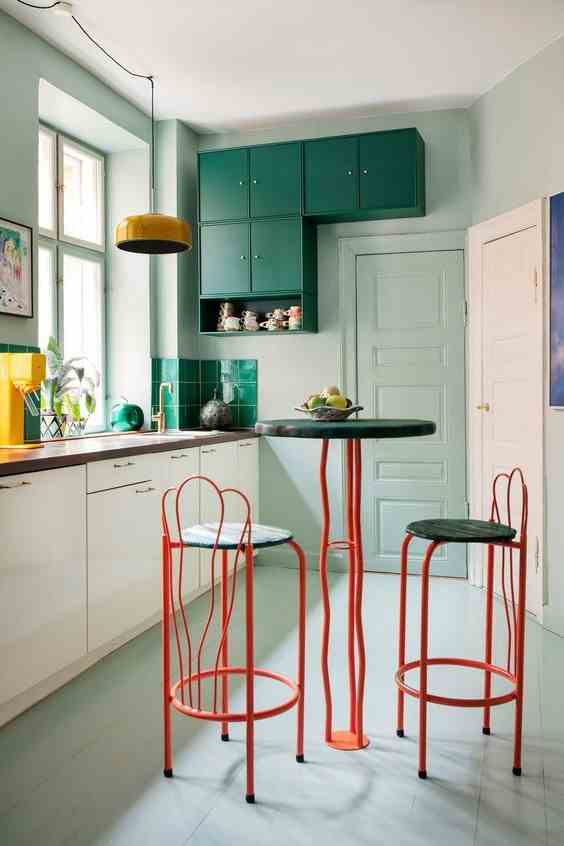
Used as a dominant color, turquoise green gives an exotic and sunny character to the decor. To give it depth, use a few darker touches, for example to highlight the niches. To warm up the bathroom or kitchen, bet on a classic: solid wood.
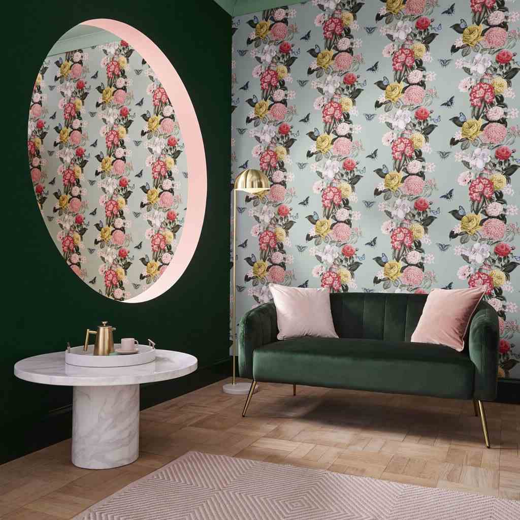
For a Scandinavian or neo art deco style, play on the extremes by combining a mint green with a deep green – such as fir green or bottle green. It is therefore preferable to invite a third color into your interior to warm it up a bit. Powder pink and saffron yellow are two classics. For a more up-to-date touch, fall for one of the major color trends for 2023: wine color.
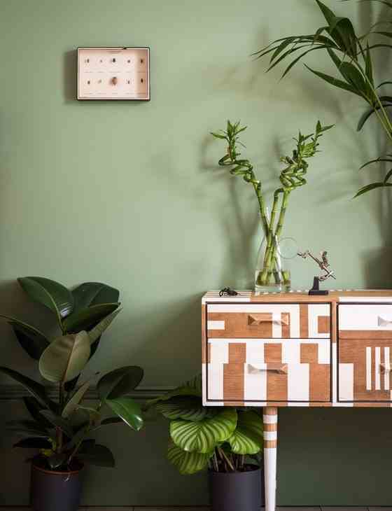
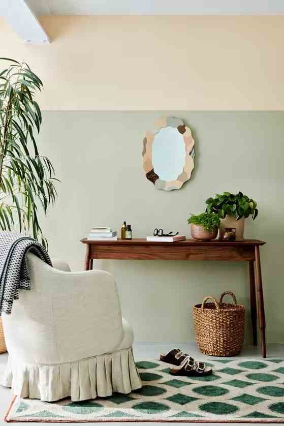
If you’re not really inspired, go for a single shade of green paired with a trendy neutral – sand or warm brown, for example. Then introduce other shades of green by simply playing with plant decoration.
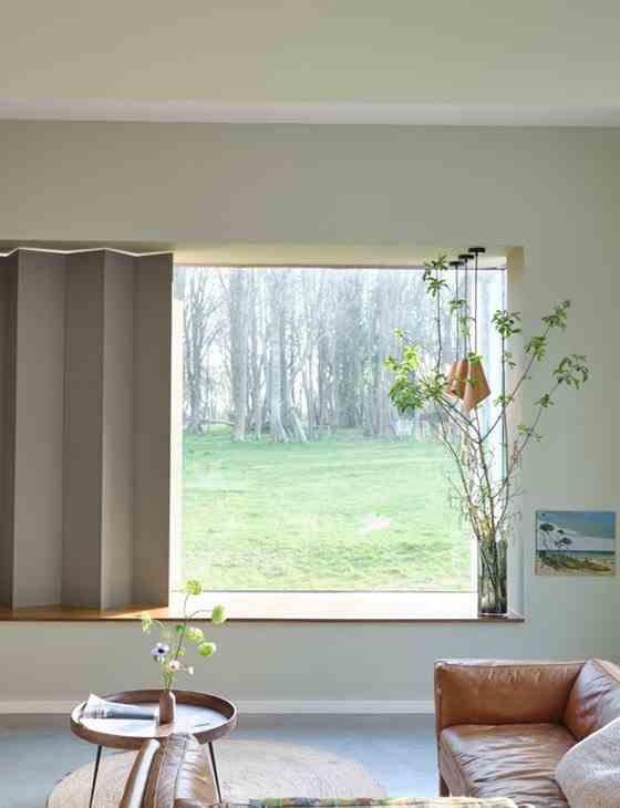
Very light shades of green are very trendy this year. We adopt them without hesitation to bring a little freshness to the pastel kitchen. They are also preferred shades for enlarging a small room. For maximum effect, think about the ground: a darker color will bring depth. For a harmonious decor, go for a very intense green, forest green type.
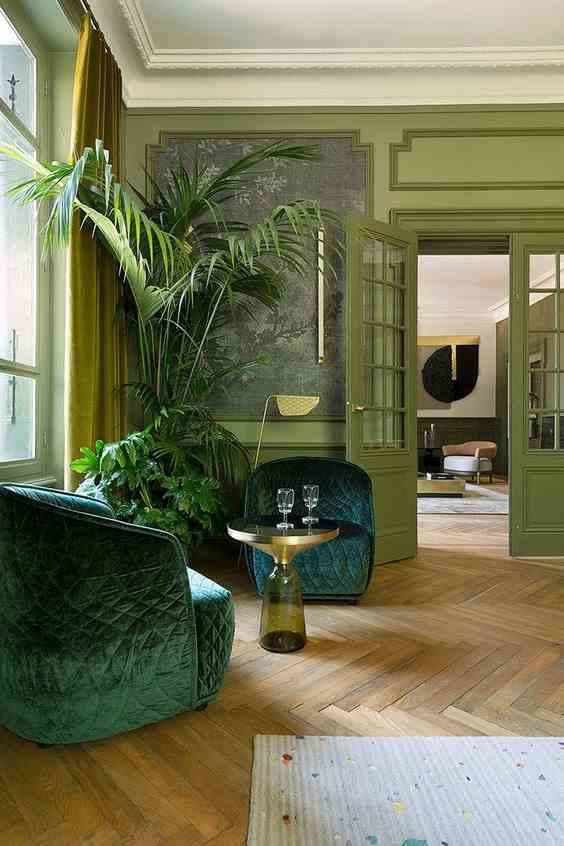
Green is made up of a mixture of yellow and blue, and it is rarely neutral: when blue dominates, we obtain an aquatic shade, duck green type; on the other hand, when the yellow dominates, we obtain a more acidic green. Combining these two types of green can be tricky. Yet this is the bias of this large living room, which combines walls painted in acid tones with bluish furniture. The little trick that changes everything? The coffee table, which creates a subtle reminder of the walls.
To be sure to avoid bad taste, use a single green, and decline it in different intensities: this guarantees you a harmonious decoration.
The alternative to composing an irreproachable palette is to choose only slightly muted greens. Whether they are blue or yellow, they will all have a very slight touch of gray that will allow them to get along perfectly. And in addition, these shades are terribly trendy!
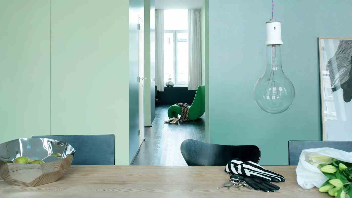
It doesn’t matter if you want to combine shades of blue, green or any other color: it is better to be careful to balance your effects. With a shade having a powerful visual impact such as mint green or emerald green, we go for a very deep green or, on the contrary, very light.
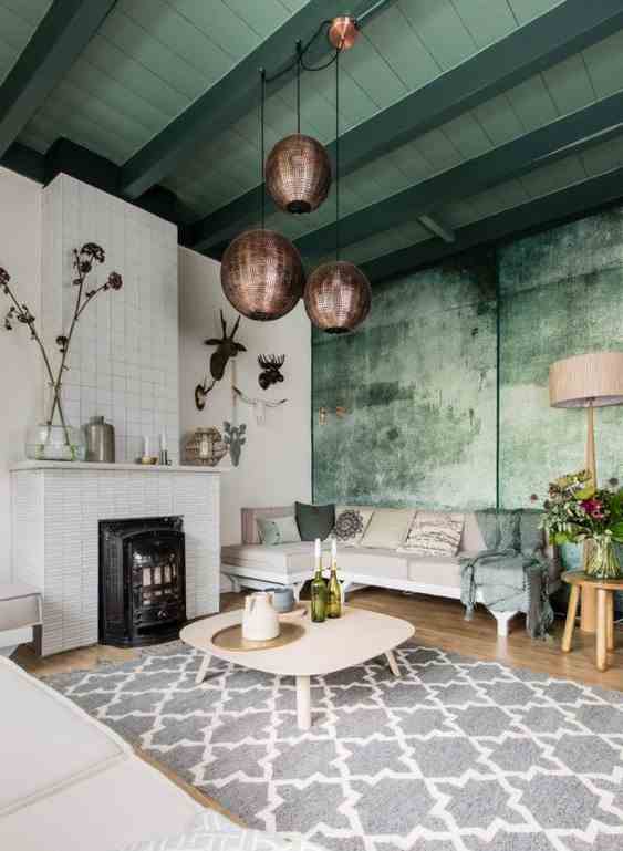
In this large living room with exposed beams, we dared to use a colored ceiling by combining two shades of green. These are found on the wall, where they have been mixed to create a very current textured effect and create an even more harmonious atmosphere.