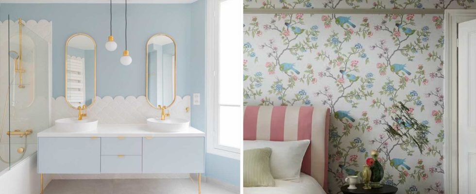
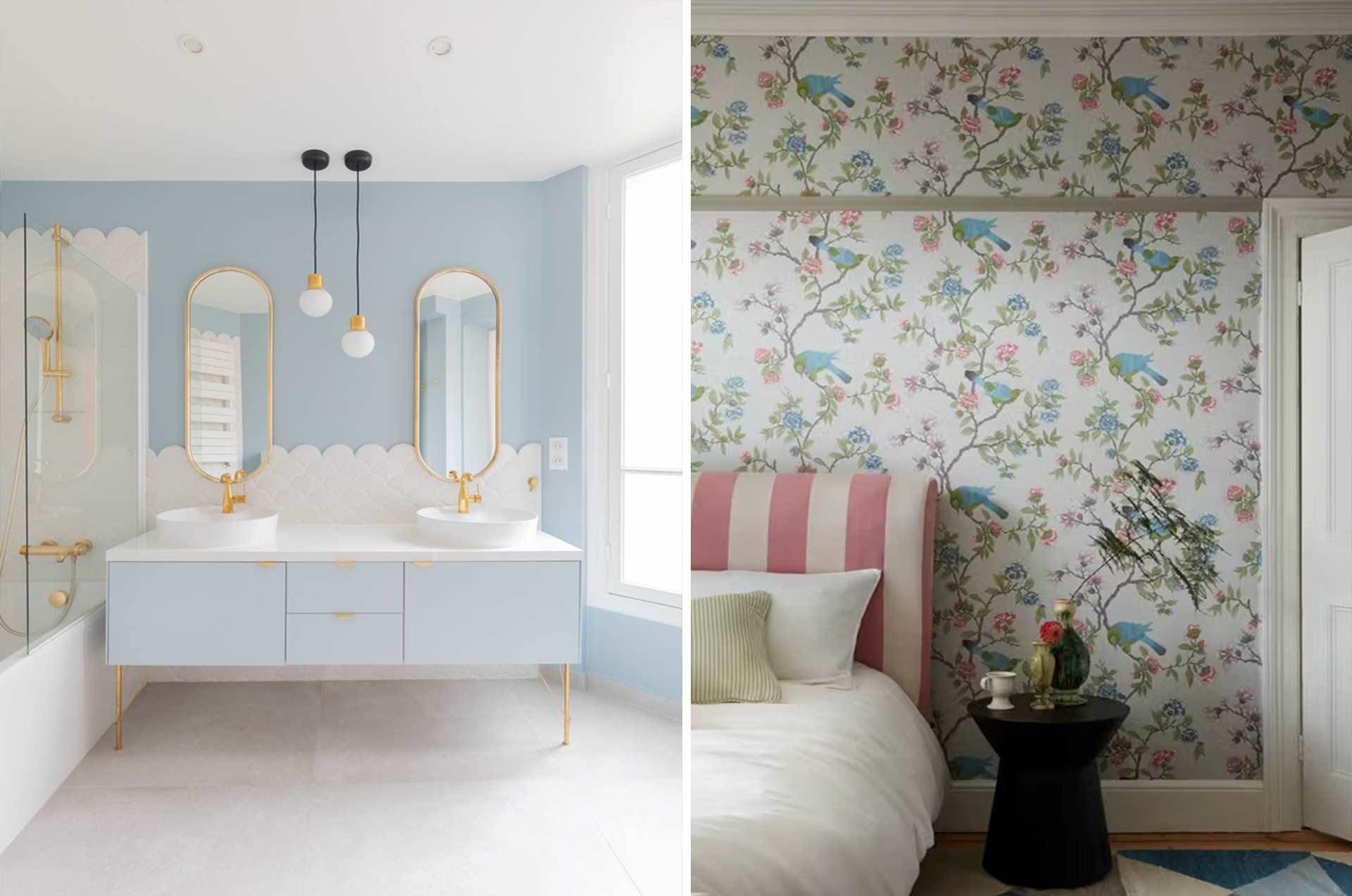
What colors for the bedroom?
The bedroom is, in essence, a space dedicated to sleep, which is an essential element for good health. This is therefore the room in which the choice of color is most crucial.
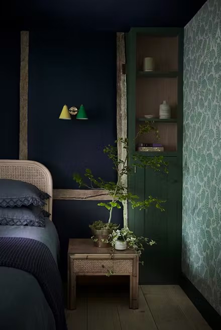
Specialists agree to recommend cold colors. Green is in fact associated with serenity, while blue has the particularity of being soothing. It even seems that the ideal color for the bedroom is midnight blue, which would promote deeper sleep.
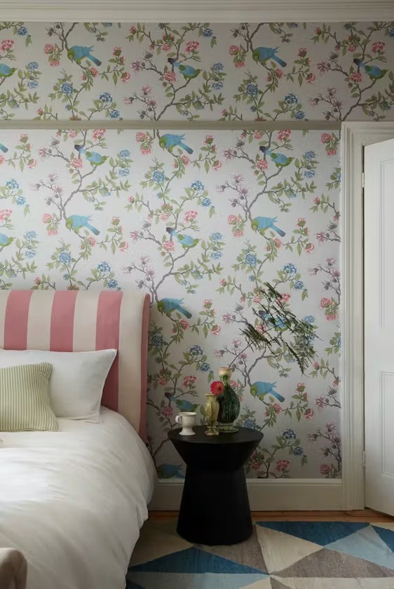
Very dynamic and stimulating, warm colors are however not recommended in the bedroom. According to the principles of Feng Shui, a touch of passion is however welcome – favoring variations of red and pink. For a perfectly balanced decor, think about the combination of pink and blue.
What color for the bathroom?
Blue is undoubtedly the color that seems most obvious in the bathroom, since it evokes water. In addition, this shade creates a soft and peaceful atmosphere, ideal for adopting color while exuding a Zen spirit.
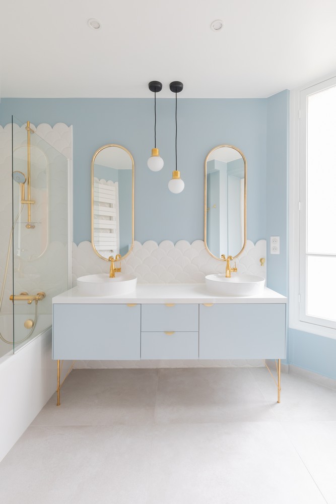
In this water feature, however, you may prefer a warm color. To maintain a relaxing atmosphere, however, we should avoid overly vibrant shades. Choose powder pink, coral, terracotta, or go for deep reds like plum or burgundy. For a sunnier touch, go for pastel yellow or ocher yellow.
What color for the kitchen?
The kitchen is one of the living rooms, and in theory, all colors are welcome. You can therefore be bold and go for warm and vibrant colors like red, yellow or orange. These colors are also known to whet the appetite.
Very current, green is a classic for giving color to the kitchen. It is even said that its very natural aspect would encourage eating healthier. If this last point remains to be proven, cold colors tend to tire us less quickly than warm colors: it is therefore a good option for adopting colorful cuisine.
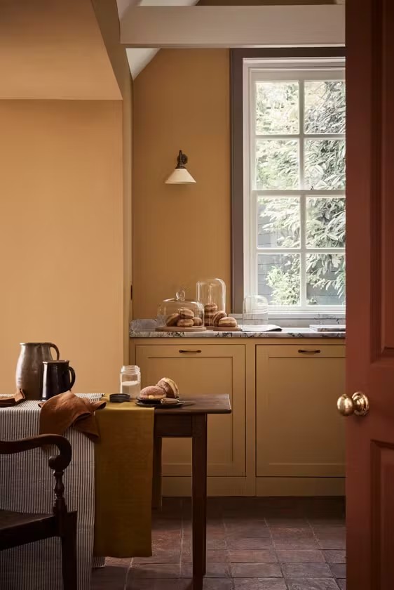
What color for the dining room?
The dining room is a space dedicated to conviviality and indulgence. We therefore favor colors that invite you to sit down and share a good time. The warm brown palette is a very good choice – especially as these neutral shades have a very versatile character allowing for varied looks. To introduce color, consider warm, earthy hues, such as ocher or terracotta.
Do you prefer cool colors? Opt for a muted shade of green or gray, for an atmosphere that is both fresh and full of softness.
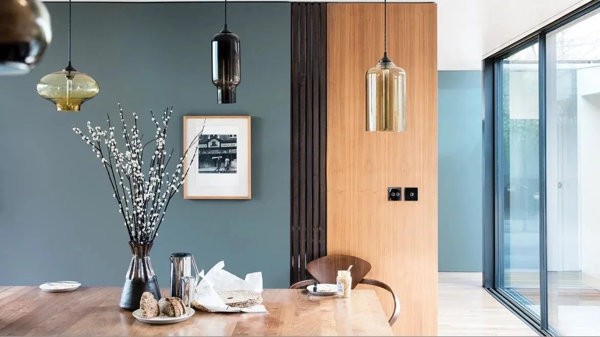
What color for the living room?
In this living room, the choice of color depends primarily on your living habits and your decorating desires. If above all you like to relax in your living room, opt for a comforting brown, a reassuring green or even a soothing blue. Also think about earthy or muted colors. If your living room is more of a convivial place, dare to go for a more dynamic palette, by adopting vibrant shades: bold red, sunny yellow, mint green or even indigo blue.
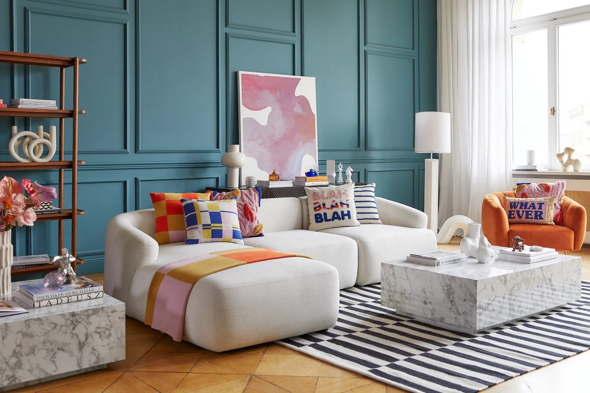
For you, the living room should be cheerful and peaceful at the same time? Choose a cold dominant color, and introduce more dynamic touches by playing with furniture and accessories.
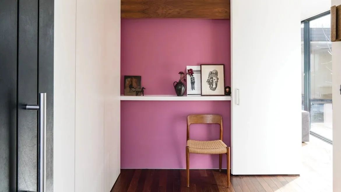
What color for the office?
The office is a space dedicated to work. We therefore recommend colors that promote anchoring and reflection, such as black or brown.
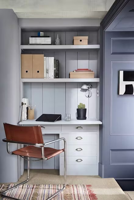
Choosing the ideal color, however, depends on the type of activity and individual temperament. If your work involves a lot of creativity, it is possible to opt for stimulating shades like orange, yellow or red. To prevent stress, prefer cold shades.
What color for the hallway or stairs?
Transit spaces are by definition places that we use simply to move around: it would therefore be tempting not to pay much attention to them and to opt for white. Especially since it’s the brightest color: great for these often very dark spaces!
White, however, is rather impersonal – which makes these spaces feel cold and unpleasant. For a more cozy interior, do not hesitate to be bold by adopting vibrant colors, especially in the entrance: it is important that it is welcoming, since it is the first thing that your guests see when arriving .
Corridors and staircases are tricky spaces to decorate, because it is often not possible to integrate furniture or furnishings. Color is even more useful to give them character. To reconcile originality and brightness, think about the wall frieze or even the fresco.
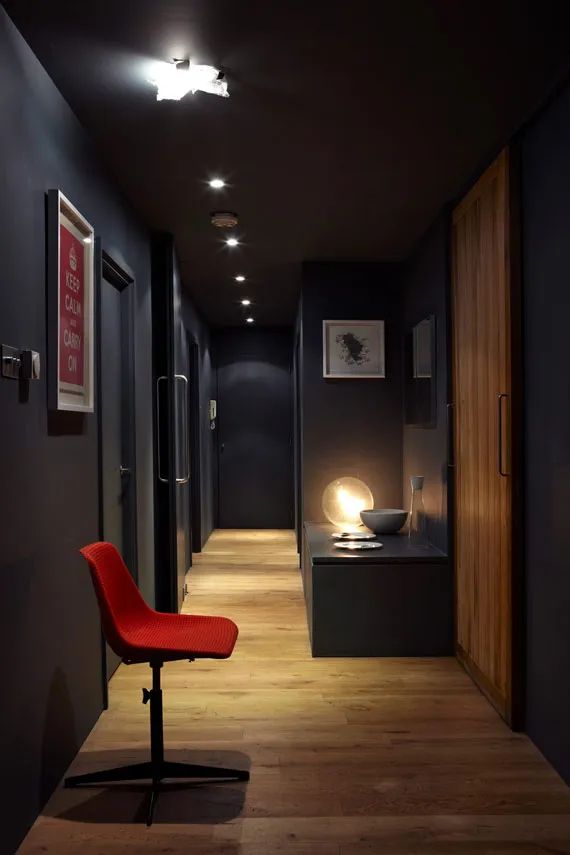
The most daring option is to dare a deep color like midnight blue or charcoal gray. This approach requires a lot of care with the lighting, but it instantly creates a cozy atmosphere.