Powder pink
Victim of its success, pink is definitely one of the “has-been” decorating trends to absolutely abandon this fall! However, everything started out pretty well.
Remember at the beginning of 2023: Pantone announces Viva Magenta! as the color of the year. This shade flirting with red then brings back in its wake the entire palette of pink, which quickly takes center stage. The only thing is: since then, the Barbie phenomenon has been there! And let’s be honest: pink may be soft, delicate and full of charm, but we’re flirting with overdose.

And this fall, the shade we don’t want to hear about anymore is powder pink.
Duck blue
Blue is the preferred choice for adopting color at home while avoiding bad taste. From one season to the next, it is never far away! But as is often the case in decor, it’s all about nuances. This fall, some bruises tend to disappear. This is particularly the case for pastel blue, turquoise blue and navy blue – which have been at the top of the trends since 2020.

The one that is bowing out for good, however, is duck blue: the shade to avoid at all costs this season!
Mouse gray
Gray was so successful that it came to replace black. It must be said that it is a perfect ally for bringing a graphic note to the decor – while remaining very soft on the eye.
This muted color also has the particularity of enhancing the most delicate colors such as pastels, as well as materials: plant fibers or beautiful wood species. The mineral trend has also contributed to the great popularity of gray. But if it remains current, concrete is giving way to other materials, such as travertine. Brief ! You will have understood: the reign of gray is coming to an end!

This season, we are definitely turning the page on gray – and more specifically mouse gray! And we open the door wide to black, which is making a comeback.
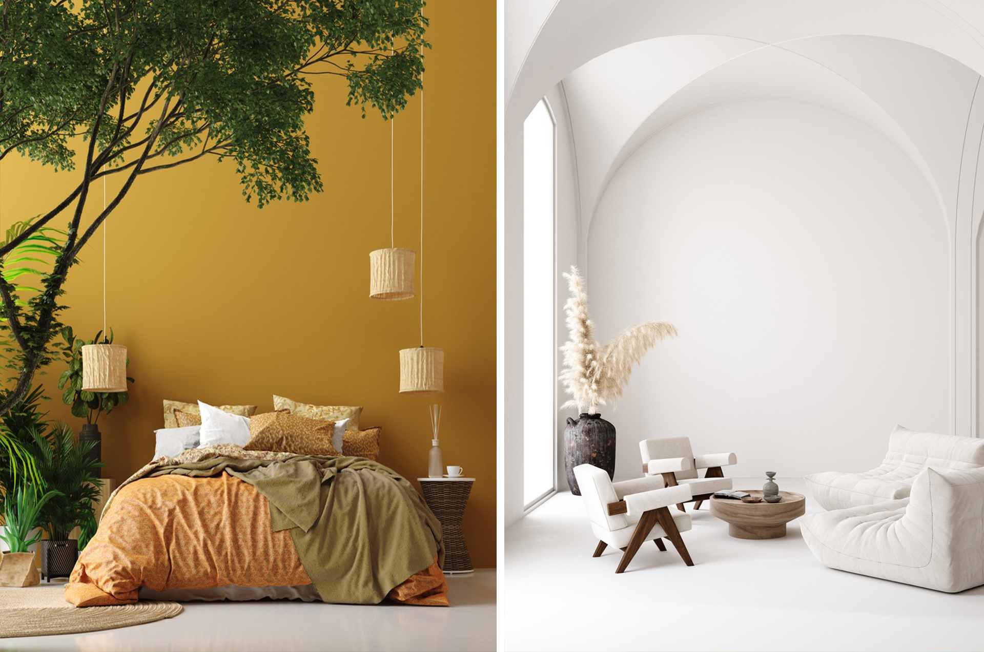
White in total look
Timeless, white? Yes and no ! Sometimes we find it peaceful and bright, sometimes cold and boring. If the minimalist trend or the Japandi style brought it back into favor, here it is once again losing momentum. Just like gray, it benefits from the status of neutral color: there is therefore no risk of it disappearing completely from our interiors.
But these days we use it as a secondary color, to highlight a terracotta color, brown or even red – these colors to adopt without hesitation in our interiors this fall.

The total immaculate look, on the other hand, we forget! To break it up without completely redoing your interior, think about wallpaper.
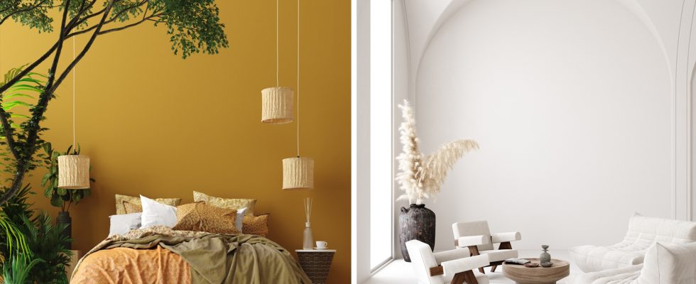
Mustard yellow
Mustard yellow is one of the key shades of 1960s decor. It has therefore taken our interiors by storm with the boom in retro decoration – one of the big trends of recent seasons. Yes, but there you have it: the Sixties, we’ve had enough of them! It’s now the 70s that are on the rise. To tell the truth, this season, we’re even starting to look at the 80s!

So no more mustard yellow: make way for brighter shades!