
How to use color for a trendy interior?
In recent seasons, the trend has been for colorful interiors. In 2022, this is more true than ever! And to be honest, at a time when the minimalist trend has imposed itself in our interiors, it is even on them that we focus our attention. Thus, in 2022, the trend is above all for complex palettes, and we are more daring than ever to bold applications, by trying out a geometric pattern or a strip of color.

Borrowed from the catwalks, the Color Block becomes this year absolutely essential in our interiors, which gain in cheerfulness and fantasy.

This year, the cocoon spirit is more relevant than ever. We therefore focus on a softer palette, with dark colors that decrease in tone and contrasts that are less marked.

Fans of a wiser interior will opt for the other major color trend of the year: monochrome. This extremely simple technique which consists in declining a single color in different intensities creates a harmonious, elegant and peaceful atmosphere.
Neutral colors
This year, white is struggling to perform well. It is true that the minimalist trend has largely imposed itself, and that in a refined interior, a pure white can turn out to be a bit too cold. However, this essential does not take its bow for all that! To adopt white, we pay attention above all to the details.

White is preferred on a textured or very lightly tinted wall. In all cases, there is no question of betting on the total look: it is rather associated with light colors such as beige or nude.

White is also featured in Memphis-inspired interiors – which revisit the spirit of the 1980s by giving pride of place to a bold design and bright colors.

If white is struggling this year, it is because beige and off-white are unabashedly asserting themselves. With their slightly sunny touch, these elegant and bright neutrals are sufficient on their own, and fans of a refined decor can dare the total look without hesitation.

This year, beige and ecru are also used as a base color, to adopt colors with a more assertive character, such as carmine red.

After having reigned supreme over our interiors for several years, gray now tends to be a little more discreet. But we could not quite do without him, and his particular talent for sublimating the most delicate colors. We therefore focus on light to medium shades, which we associate in particular with the color lilac, which is making a noticeable comeback this year.

In the large family of neutral colors, browns are the must-haves of the year.

If we like all the nuances evoking the earth, this year, we love the variations with warm notes, which draw on ocher or amber.
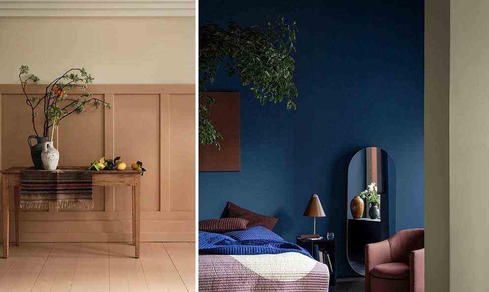
Cool colors: blue leads the way
This season, if there is one color that seems to be unanimous, it is blue.

Horizon Blue at Dulux Valentine, Restore at Graham & Brown: gray blue has the luxury of being voted color of the year by two of the biggest color publishers. Suffice to say that if you want to make sure you’re in tune in 2022, you can adopt it without the slightest hesitation!

This year, we will have to rely on another shade of blue with a strong character: indigo blue.

For a 100% trendy palette, we associate indigo blue with olive green or warm trendy colors: red or aubergine.

Although blue gladly takes center stage, green is hardly outdone. Once again this year, we fall for this fresh color, associated with nature, with a slight preference for light shades: sage green or celadon green.

This year, it’s hard to miss out on khaki green. This subtle and rich color is also particularly elegant in association with the hottest shades of the moment, such as indigo or plum.

Halfway between cold and warm, purple has made a comeback on tiptoe. This year, he must nevertheless be reckoned with – or more precisely, with one of its most delicate variations: the color lilac.
Warm colors: powdery and acidic
Soft and tender or resolutely spicy: this year again, warm colors are not left out!

On the wall, on the carpet or on the sofa: in 2022, lemon yellow comes to the house in small touches. And it is all the more dazzling!

In large format, we prefer a wiser ocher yellow, but just as sunny.

Driven by the craze for the Memphis style, saturated colors – even almost neon – are making a comeback in our interiors. Among the must-haves: orange, of course.

In a Scandinavian, contemporary or Japanese-inspired interior, this year we prefer to adopt a coppery orange, warm without being extravagant.

Bed linen, rugs or furniture: we love the aubergine color more than ever. If it goes nicely with ecru or green, it is with navy blue or indigo blue that it is most trendy.

Between color and neutral, your heart swings? The nude (or pinkish beige) will make you fall in love! This soft and luminous color is full of imagination. In the hallway, in the bedroom or in the living room, by little touch or to dress the walls, it’s very simple: not only is it trendy, but in addition, it can do everything!

Among the trendy colors for 2022, it’s hard to miss out on powder pink. Like nude, it offers a nice balance between neutral and color. And it is also extremely easy to use and combine. Short ! We could not do without!

It has already been a few seasons that it has been one of the top trend colors, and it is clearly set to last: this year again, the color terracotta is simply essential. Especially since it allows sublime associations of colors. We particularly like it associated with beige, in all simplicity, or skilfully balanced with a touch of blue.

It is so dynamic that we make sure to adopt it in small touches: red is nonetheless one of the trendiest colors of the year. But to be in tune, there is no question of taking half measures: we therefore opt for a vermilion or carmine red.