What are the criteria to take into account when choosing the painting for the living room?
If you want to benefit from a bright living room, you must first of all take into account its configuration:
- Is the room big or small?
- Exposed to the north or south?
- Does it get a good amount of natural light?
In the rooms with the poorest light, so white and cold colors are preferred. In beautiful volumes bathed in generous natural light, on the other hand, it is possible to bet on warmer colors to create a bright atmosphere in the living room.
The tip of the pros so as not to miss it: think about the show as a whole. Indeed, a skillful play of contrast between painting and furniture – or between wall painting and floor – that can make all the difference!
White in the living room: instructions for use
White is THE luminous color par excellence. With him, impossible to miss. Yet – would you believe it? – it is possible to work on it so that it has even more effect!
If the white living room is timeless, it is because it is incredibly bright. When it comes to painting, everything is nuance. Here, we opted for a pure white. In order to maintain a soft aesthetic, it was accessorized with muted colors. Pay attention to the choice of bulbs, because at nightfall, the white will of course reflect the light. We therefore avoid cold light, which would soon be blinding. And we opt for bulbs diffusing a warm light. Be careful, too, with the choice of lighting: it is better to multiply the light points, rather than opting for models that are too powerful!
If pure white is luminous, it is also “raw” and a bit impersonal. To remedy this, you can choose a very slightly broken shade. In rooms with poor light, opt for cool undertones. In a well-exposed living room, on the other hand, you can opt for a warmer shade.
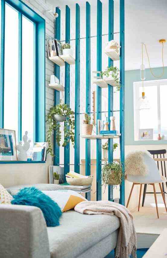
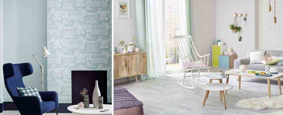
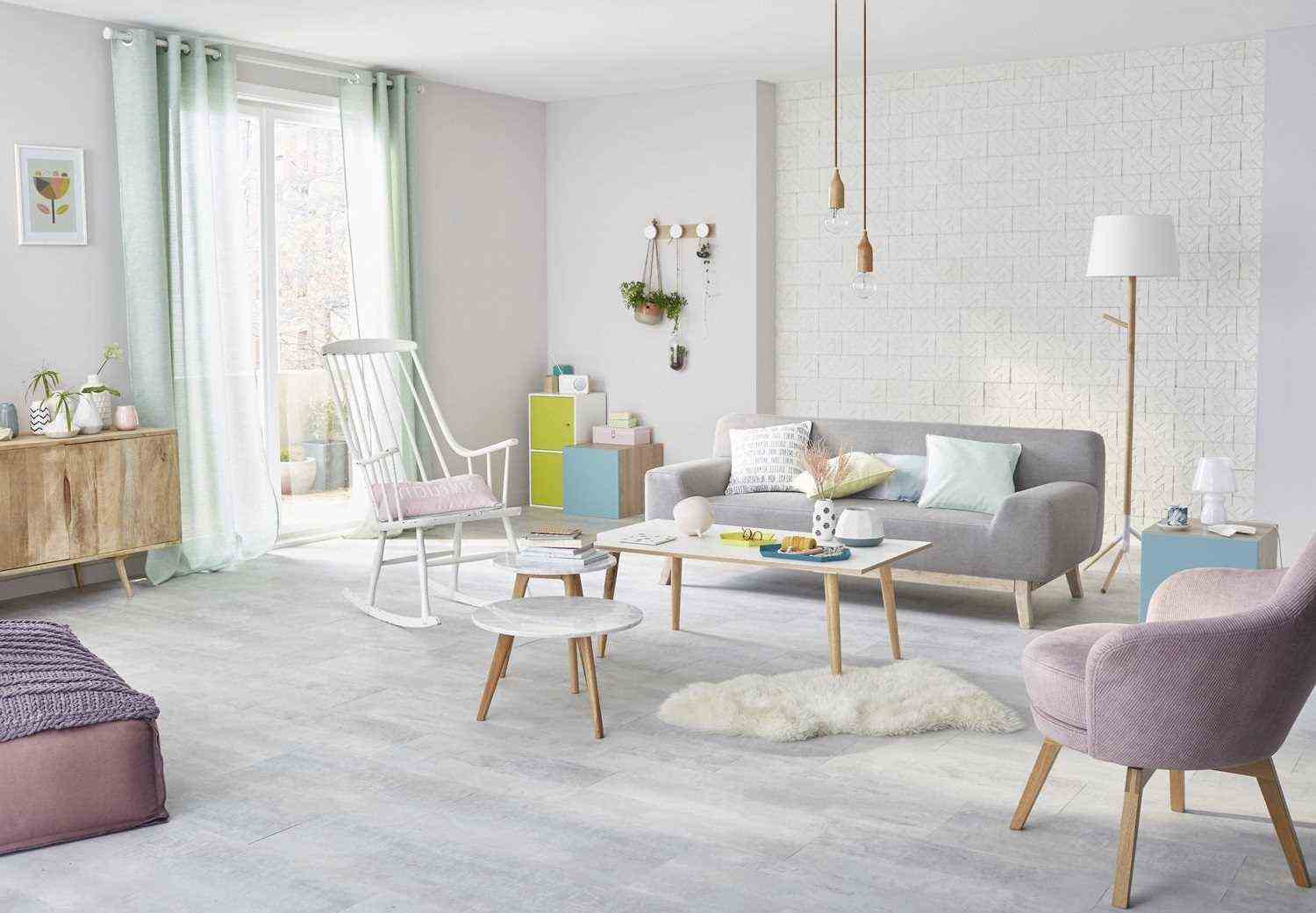
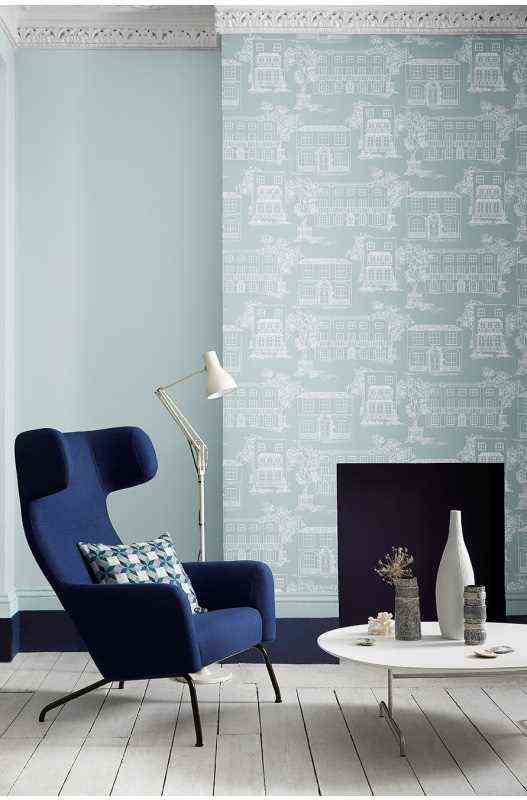
If you dread the too impersonal side of pure white, you can work it in combination with another color. The combination of an aquatic shade and pure white is particularly brilliant. In a small space, we will therefore take care to work the color with skill. Here, it highlights the window and the half-partition, bringing a graphic touch while boosting the brightness of the living room.
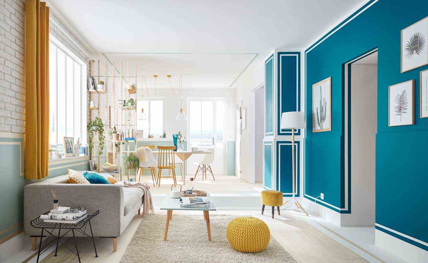
If you have to dress large sections of wall, don’t hesitate to think outside the box, by forgetting the traditional uniform application, and working color and white together. Not only that the brightness, but a touch of whimsy will also bring lightness to the room.
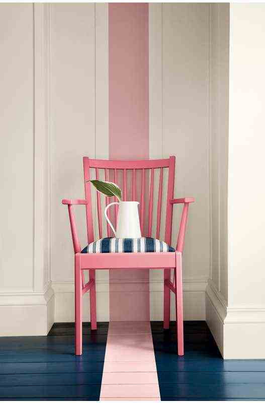
Pure white will also work with a warm color – here a coral pink, very slightly orange. We love the tie & dye effect, original and perfect to obtain a nice balance between color and luminosity.
Tinted with a hint of yellow, white takes on a more convivial allure. Worked with a decor that gives pride of place to wood and warm colors, it creates a bright and cozy atmosphere in the living room.
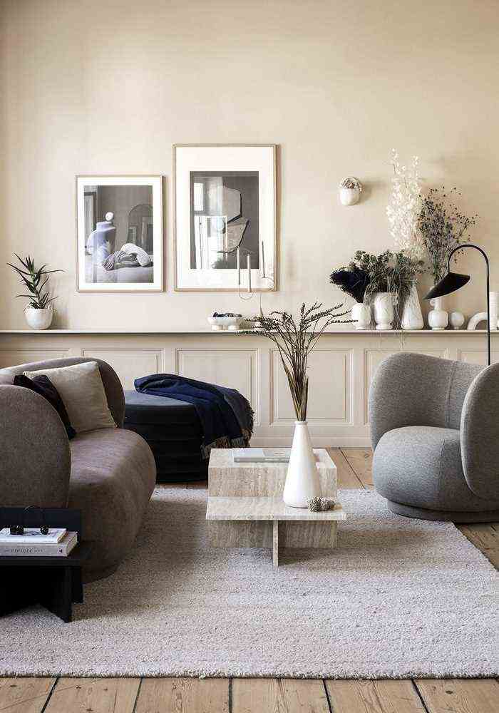
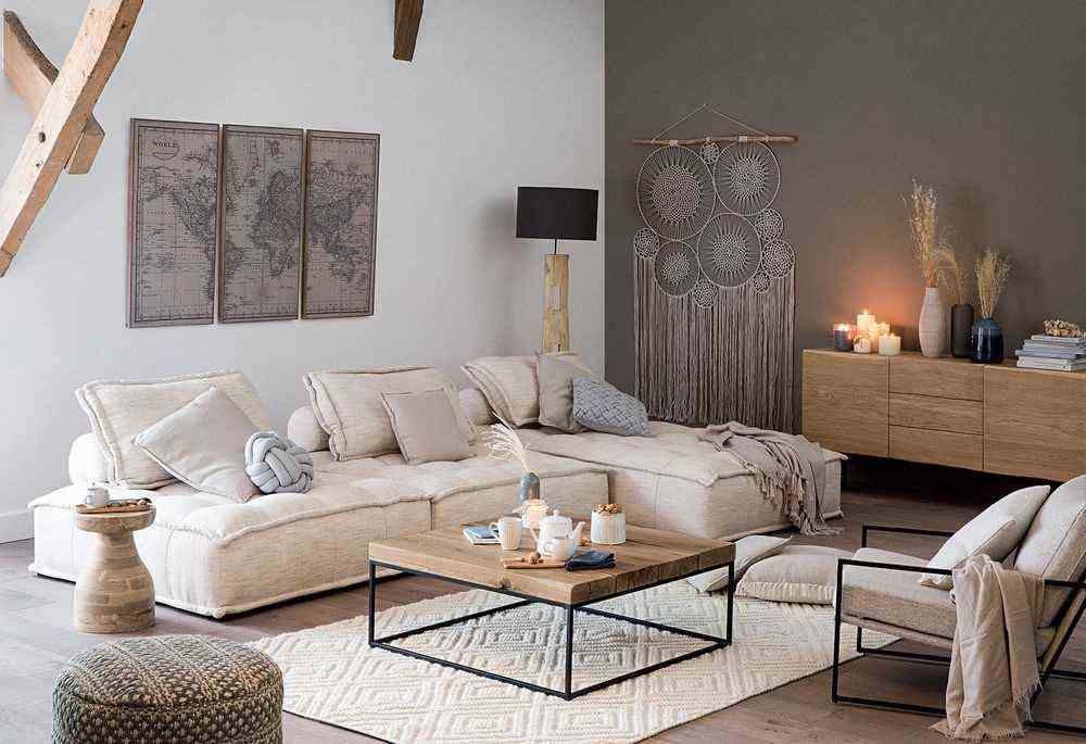
Beige is a great alternative to white. On the decorative side, the cozy materials and raw wood soften the very mineral touch of the table. Here is a bright and soft living room, where a pleasant slow life spirit reigns.
Muted colors to make the color pop
We speak of “muted color” to designate a color that does not reflect light. These shades have a special feature: they highlight the vibrant colors. They thus make it possible to create skilful games of contrast to boost the brightness of the living room.
In this very pale taupe setting, the very modern green that dresses the base and the door sparkles, just like the very colorful furniture: here is a decoration full of cheerfulness, which literally illuminates the living room!
Associated with a light beige, the taupe color brings relief to the decoration of the living room. If it is only present in discreet touches, it is enough to give a boost to colors and prints. The decoration is thus sparkling and luminous.
Simple and effective, the combination of white and medium taupe always has its effect. This timeless tandem creates an atmosphere that is both bright and very chic in the living room. And a bohemian decor even takes on a very chic allure!
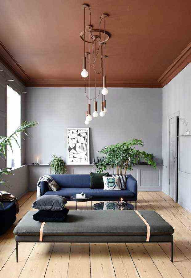
In this living room with a very modern Nordic spirit, pearl gray sublimates the terracotta ceiling and fully reveals the luminosity of this very trendy blue sofa.
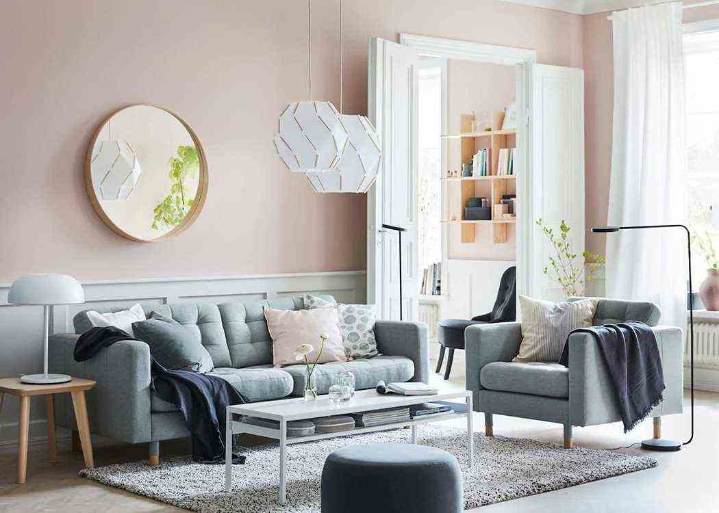
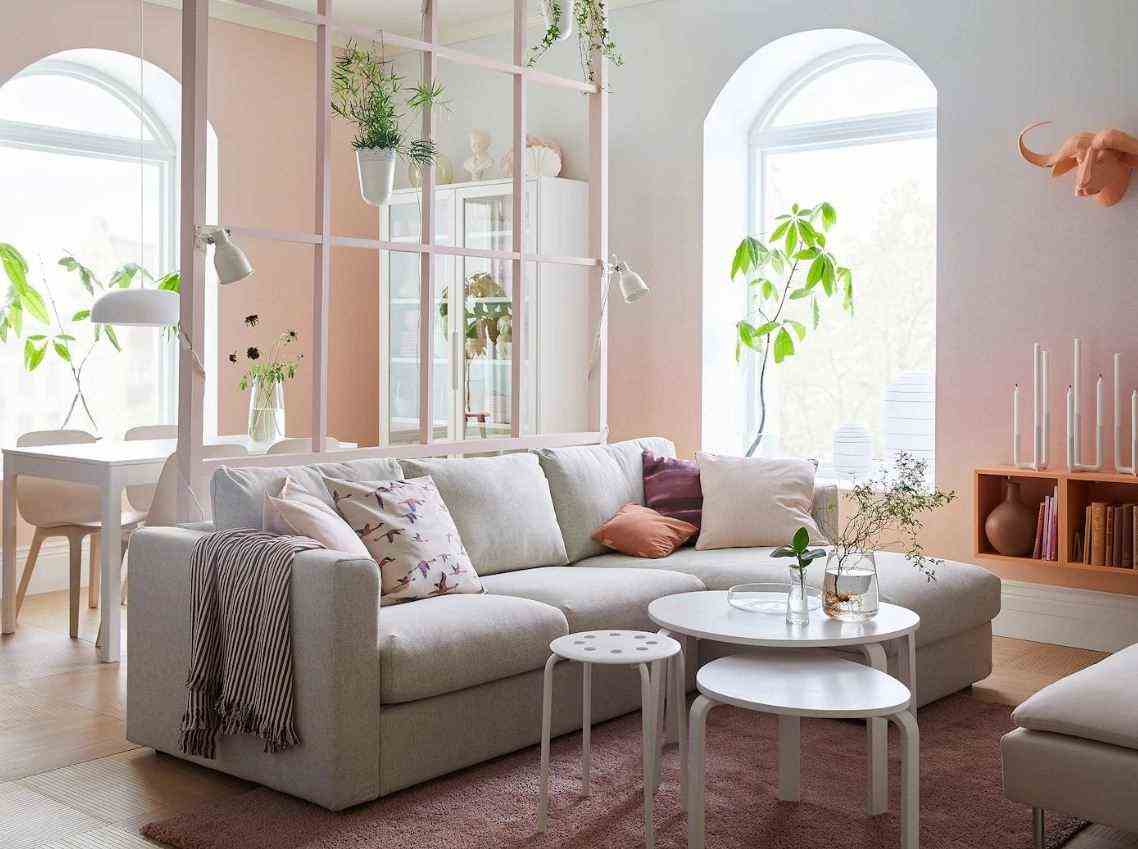
Boudoir atmosphere for this living room where pink reveals all its subtlety. A tender duo, illuminated by a touch of white which brings additional relief to the decor of this tender and bright living room.
A bright living room in color (s)
Are colors and luminosity incompatible? Certainly not, when you know a few tips for choosing and applying your palette!
The very current dark blue makes you dream? Associated with a very pale blue, it will sublimate the living room. For maximum brightness, we focus on pure white on the floor as well as on the ceiling, and here it is.
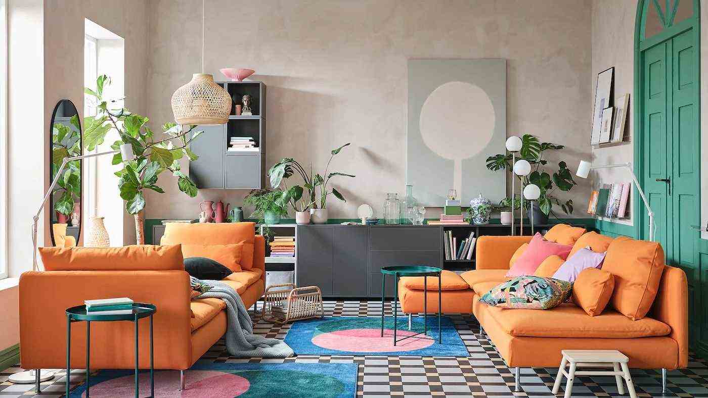
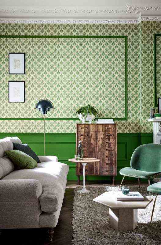
The total colorful look? Yes, but on condition that you opt for two shades. Here, we underlined the architectural peculiarities of the room of a slightly darker green. A trick that boosts the effect of relief and depth.
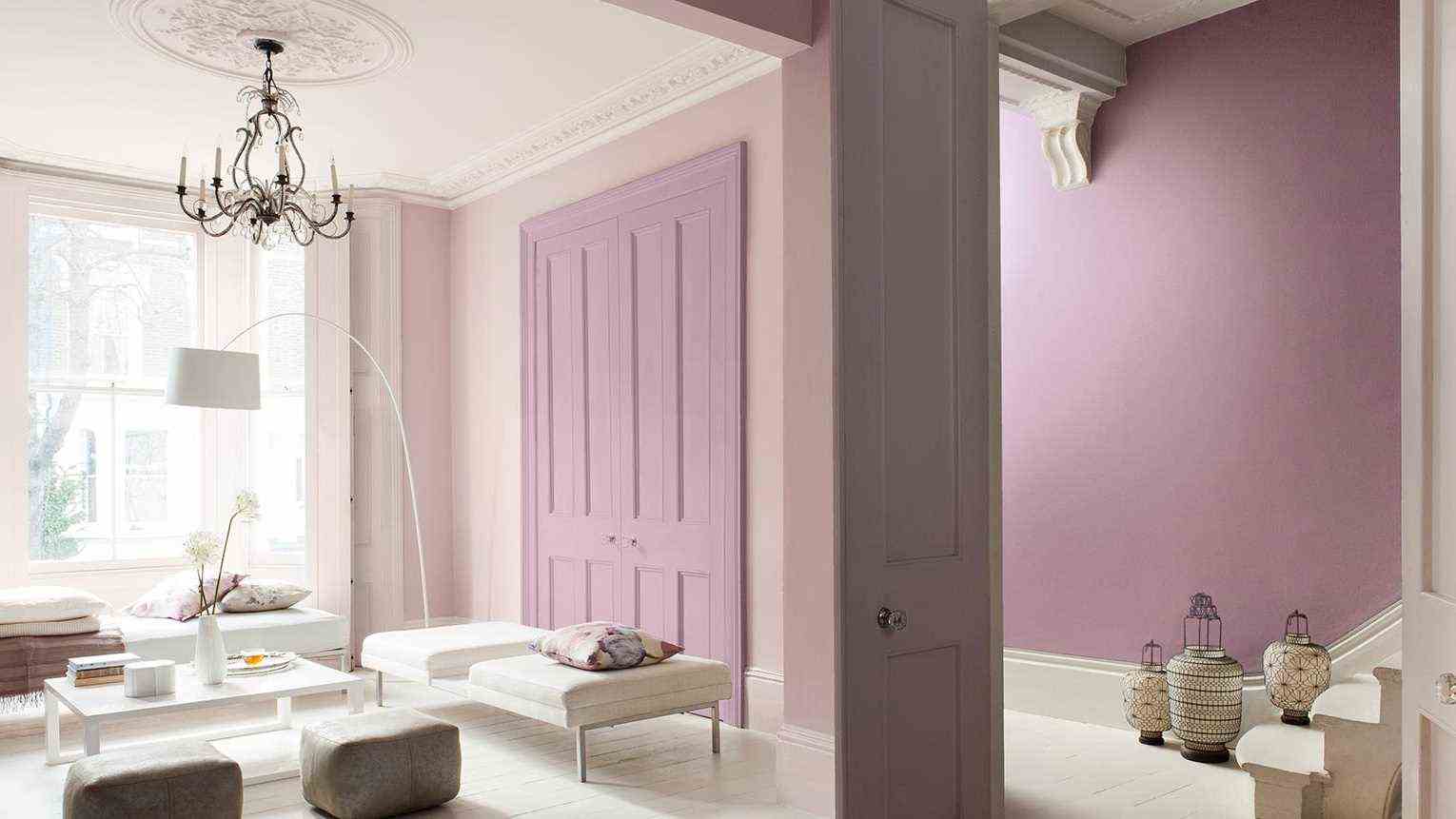
The trick works just as well with warm undertones, like the pink and mauve that dress this very chic classic living room. To maintain maximum brightness, apply the lightest shade to the walls, and use the darker as an accent color.
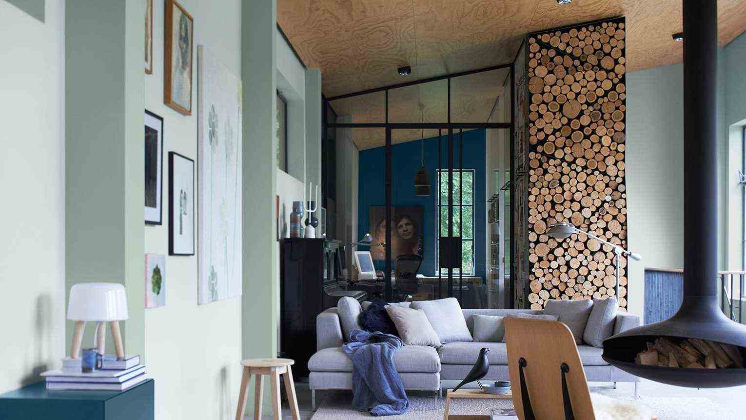
Greens and blues rich in yellow pigments are very bright. However, the total look can be overwhelming if natural light is not present. The good idea: dress the base in color. Depending on the type of decoration you prefer, you can opt as here for a wallpaper or for a plain light color.