Yellow: the 16 most beautiful shades for your interior
This year is marked by the big comeback of bright colors, even downright neon. Now is the time to fall for one intense yellow.

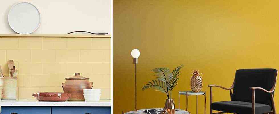
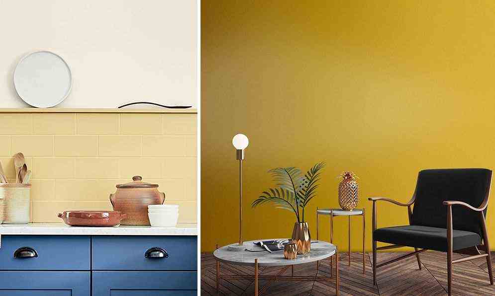
In this very contemporary interior, we chose a dynamic lemon yellow. This color contrasts nicely with bright cool undertones, such as duck blue. It’s also a great choice if you appreciate 1980s-inspired decor.

In this stylish interior, we dare a warm lemon shade in total look. This warm yellow breathes a playful spirit that plays down this very strict framework. Very popular between the 1950s and 1970s, this type of yellow is also the ideal choice for a Mid Century decoration.

Buttercup yellow and poppy red : a floral and warm atmosphere reigns in this space dedicated to work. This duo brings dynamism to this interior dominated by white: this is the ideal atmosphere for both reflection and creativity.

This year, bad news for the white kitchen: it is a bit outdated. But don’t panic: to bring it up to date, no need to change everything! You just need to wake her up with a little color. What if we dared acid yellow ? Very saturated, this shade flirting with the neon color goes perfectly with the trendy colors of the moment: pale terracotta or mint green.

Who said the landing was just a passageway that wasn’t worth pampering? Dressed in golden yellow, it is so warm that you would almost settle there to chill!

Iconic color of Scandinavian style, pastel yellow is not lacking in daring. In this small kitchen, he joins forces with brick red and at black parquet – still very trendy – for a very current Color Block spirit.

If intense yellows scare you, embrace the other big trend of the year: earthy colors. In this show, we have thus selected a shade of yellow based on brown, which offers a perfect balance between character and sobriety. What to dare serenely the colorful furniture !

More muted than a traditional pastel yellow, this light ocher yellow discreetly illuminates the kitchen. Here’s a great idea for bringing some color into a contemporary country chic kitchen, especially if you go for a cool colored furniture.

Statement of orange pigments, this spicy yellow blow a little exotic spirit on the kitchen. To allow it to have its full effect, we dared to total look, by revamping the furniture in tone on tone. The smart little touch: a gray stripe on the parquet, which brings relief to the decor, and sublimates the depth and richness of this chewable shade of yellow.

In this child’s room, the decoration gives pride of place to softness and naturalness: light wood, basketwork and wool create a cocooning and peaceful space. A soft yellow sublimates this Nordic-inspired bedroom.

A wild interior, yes, but also very chic! To warm up your jungle interior, let yourself be inspired by this shade of mustard yellow, sublime in association with cold tones. To die for when combined with shades of green or medium to dark blue, this warm yellow beautifully highlights a golden decoration.

A creamy shade of yellow pairs nicely with black to create a graphic effect and very soft at the same time. This palette goes particularly well with light wood furniture or cane furniture, still very trendy this year.

Peaceful, but a bit too wise, the minimalist bedroom ? Let yourself be inspired by this yellow headboard drawn on the wall. This earthy yellow full of character goes wonderfully with the delicate dominant shade of pinkish beige, for an aesthetic sober and very chic.

How about adopting the trend of the year? Exit the white: we fall for the100% colored interior. And if you are worried about missing out, go serenely on gray blue! To awaken this peaceful color, we dare to tangy yellow.

Among the hottest yellows of the season, we fall for the bronze yellow. Very effective in bringing a touch of sophistication to an interior, this versatile shade also knows how to give depth to a very natural decoration than sublimate a chic ethnic atmosphere.

To warm up an office or a reading corner while maintaining an atmosphere conducive to concentration, we use a beautiful shade of golden yellow. We associate it with neutrals – black, brown or charcoal gray. And to introduce a note of freshness, let yourself be charmed by a trendy shade of green, such as sage green or celadon green.