15 shades of pink to enhance your interior
Pastel pink has long been associated with the nursery, and very gendered, since it was reserved for girls. If he is tender, he nevertheless knows how to be so devilishly sophisticated.

We fall for the pastel pink which flirts with the peach color. Nude, but not quite, it breathes a little chic air into the decor. It’s up to you to see if you associate it with a deep pink and precious materials, for a contemporary boudoir spirit, or if you opt for a wiser decoration, which declines sober colors such as ecru.

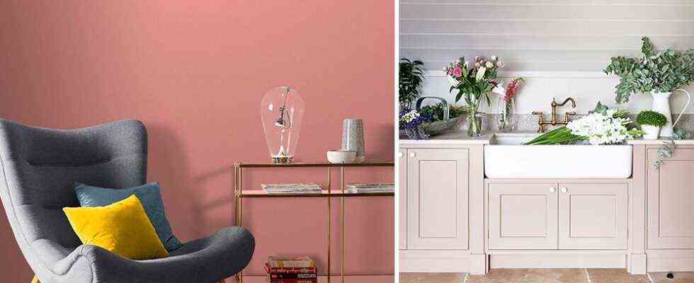
Bring a little gourmet twist to your Mid Century decor, with this coral pink pinched from the 1950s. More peaceful than red, yellow or orange, it nevertheless gives your interior pep’s. Very versatile, this shade goes just as easily with warm colors – such as sunny yellow – as it does with grayish blue, which is very trendy this year.

When it comes to powder pink, opinions are sometimes mixed: if it is crisp, it is also sometimes found a little too innocent. The trick is to sublimate it by associating it with a deep muted color – like this charcoal black. And for a truly stunning result, we work on the materials. Here we used this very tender shade to revamp a brick wall, more raw.

Is the pastel-colored Nordic bedroom lacking in fantasy? Certainly not when you associate the pastel pink has a neon yellow, and that we have fun with the gradients to bring a touch of originality to the decor!

Come on, it’s decided: this year, we are done with prejudices once and for all! Not only the soft pink bedroom isn’t just for babies, but she’s even downright hot in the parental room. Especially when it is enhanced by a touch of red ! This tandem creates a intimate and original atmosphere, perfect to wake up a japandi bedroom.

For sublimate the volumes and structure the space, we focus on color! Especially when it comes to a intense pink, which flirts with the raspberry color. To enhance this greedy office corner, we chose a taupe brown, and sprinkled the set of accessories coral pink and soft pink : a nice idea to give relief to the decor!

a very pale pink and a deep pink, which approaches the color of wine: this contemporary interior focuses on extremes. A clever bias, since the lounge area and the dining area are both harmonious and well defined.

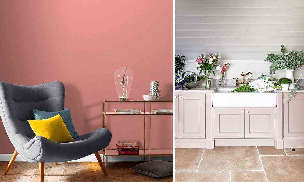
In this chic country kitchen, we gave the furniture a makeover with a very pale salmon pink, skillfully highlighted by a shade of light gray. This deliciously retro palette brings an extra soul to this chic country kitchen.

Old rose remains a safe bet. For a retro decoration – but not too much – we fall for an intense shade. Sublime in a stylish interior, this shade of pink also works to bring depth to a bohemian chic living room.

Between the old rose and the powder pink, there is the blush pink : A nuance delicate and deep. And it’s the perfect shade to add color to a contemporary interior dominated by a very mineral palette of gray.

THE’minimalist contemporary interior remains very trendy. To create an original decoration without overloading it, we work on the covering of the walls by daring arches and graphic patterns. In this dining room, nude pink and powder pink go hand in hand! We love the choice of complementary colors: a very wise golden brown and a contemporary red full of daring.

This year, you have probably not missed it: neon colors are making a big comeback in decoration. If we love lemon yellow or lime green, the acid pink also has its small effect! Especially when you mix coral pink, salmon pink and candy pink with wiser shadesor even slightly muffled. Here is the dream palette to revamp the staircase!

After the wallpaper, it is now the painting which likes to make effects. Between glitter pink and metallic pink, no need to decide: just adopt a metallic powder pink … and glitter! If you do not shy away from a daring decoration, dare the association with the wallpaper on a soft pink background, for a romantic decor who don’t take themselves seriously.

When pink is tinted with golden reflections, it takes on a clay character very current. To create a peaceful and captivating atmosphere at the same time, we associate it with colors evoking the earth, also: brown, terracotta or brick red.

This year, the Scandinavian palette raise the tone: plum, khaki green and Klein blue decorate the pawn with traditional pastels. In line with these deep colors, adopt a intense pink, and combine it with touches of chartreuse green or lemon yellow.