12 trendy shades of red
It’s a fact: bright red happily reinvests our interiors. It is particularly present in interiors with decoration inspired by the style of the 1980s… but not only!

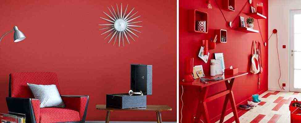
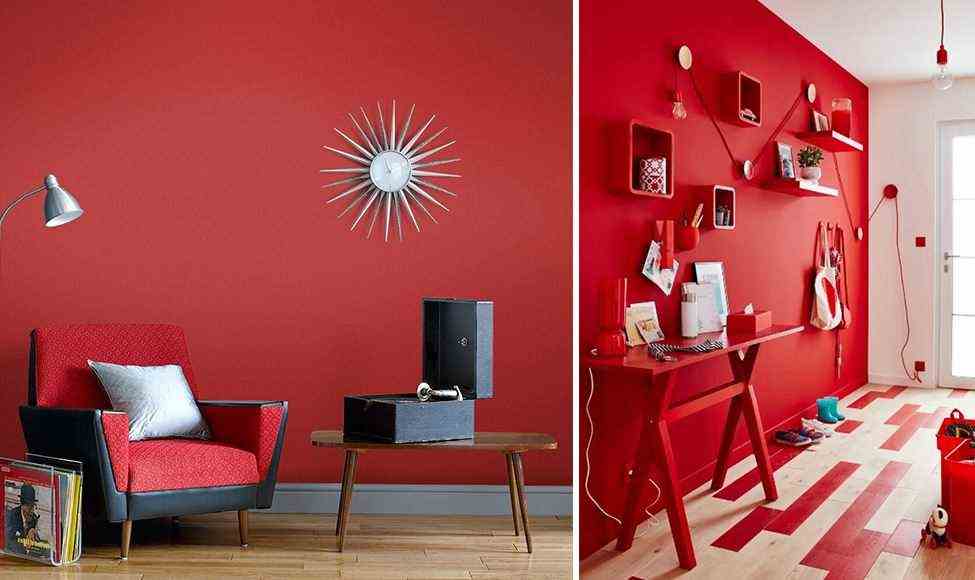
A touch of bright and luminous red is enough to transform a passage space into a warm place, where you can even settle down to work.

From the kitchen to the living room via the bedroom: wood is definitely the essential material of the year. Although it is sublime, it can lack a bit of relief when adopted in total look. The good idea is to associate it with an orange red. To succeed, go for a mat or velvety finish, which accentuates its contemporary character.

To sublimate an ethnic chic decoration or to twist a stylish interior, to bring depth to a bohemian atmosphere or to sublimate a Japanese decor: it’s very simple, terracotta red is always the color of the situation! This is undoubtedly the nuance to adopt if you are afraid of missing out.

Grayish blue and celadon green are some of the trendiest colors of the year. Peaceful and fresh, however, they need to be reheated. And what better than a vibrant red to perfectly balance the decor? This type of pallet works particularly in passage spaces such as the entrance or the landing, where they make it possible to compose a stunning decoration without being bothered with too bulky objects and furniture.

Want a retro kitchen which is a little out of the ordinary? Forget the 1950s and their soft pastel colors, and let yourself be inspired by the 1970s instead. Simply combine a gourmet orange with a brick red, and long live the Seventies!

Bring a theatrical touch to your interior by adopting a crimson red deep. With this shade of red, we can dare a little extravagance, by adding a golden note. We just make sure to dose well, so as not to overdo it!

In a room generously exposed to natural light, we dare garnet red. Depending on the time of day, it gets deep or reveals its purplish side. To sublimate this shade, we fall for a palette dominated by muted tones: gray or black.

Spice up your Scandinavian interior by adopting a trendy palette, dominated by a terracotta red that draws on brown. This shade accommodates a sober decoration, combining a very wise gray with blond wood furniture. For a really trendy decor, however, you can opt for a few notes of color, focusing on a delicate lilac or a subtle khaki green.

Literally, the color terracotta means ” terracotta “. If this red comes in a pretty palette of shades, each more trendy than the next, the year heralds a return to basics. We therefore fall for the authentic “terracotta” red. Especially since it wonderfully highlights some of the materials of the year, such as rattan, seaweed or jute.

Nothing like a red borrowed from the 1950s to add the finishing touch to a decidedly Mid Century interior. Perfectly showcasing dark walnut wood furniture, this is the must-have color in the living room if you want to create a vintage vibe authentic !

It promises to be one of the flagship colors of the year: burgundy red is back, and that’s good! This elegant – and frankly sumptuous – red is suitable for classic decoration very chic, by associating it with velvet and gold. He also knows how to be very simple, in combination with the ecru color in a more contemporary decoration.

Irresistible, the bright red in monochrome version! This bold approach has the advantage of literally making the furniture disappear, which blends with the wall. A good idea, when you choose such a vibrant color. Better to avoid the riot of color and decorative elements, for it to work.
Trendy decoration in red
Does redesigning your interior in red continue to scare you? Good news: red is also terribly trendy on the furniture side and some small decoration ! So you can collect a few items and embark on a DIY operation.

A piece of cherry red furniture illuminates a very sober interior – gray, white or beige.

Adorned in red, a piece of furniture immediately becomes a strong piece, attracting all eyes and sufficient to warm an interior dominated by a cold color.

To avoid bad taste, the easiest way is to bet on a single element painted in red. Just be sure to choose a shade that matches the dominant color. In this kitchen, we chose a Orange-red, color complementary to blue.

If you want to introduce several redesigned elements in your decoration, choose a strictly identical shade of red for each of them. This type of decoration is not only more harmonious, but also very trendy!