Mixing colors and patterns in decoration: the basics
Mixing colors and patterns creates a lively decoration. Wallpaper, furniture, rugs and cushions give the pleasant impression of having been put together haphazardly over time… which is of course completely false! In fact, it’s quite the opposite.

To create a harmonious decoration, it is important to find a common thread. It could be a theme, pattern or color.

The safest way to mix patterns and colors without making a mistake is to choose a single color, which you can vary in monochrome, and to adopt different patterns. To choose your color, keep in mind that cold colors are peaceful: with them, you can safely launch into a riot of prints. Warm colors are more dynamic, and it will be necessary to use the right balance!

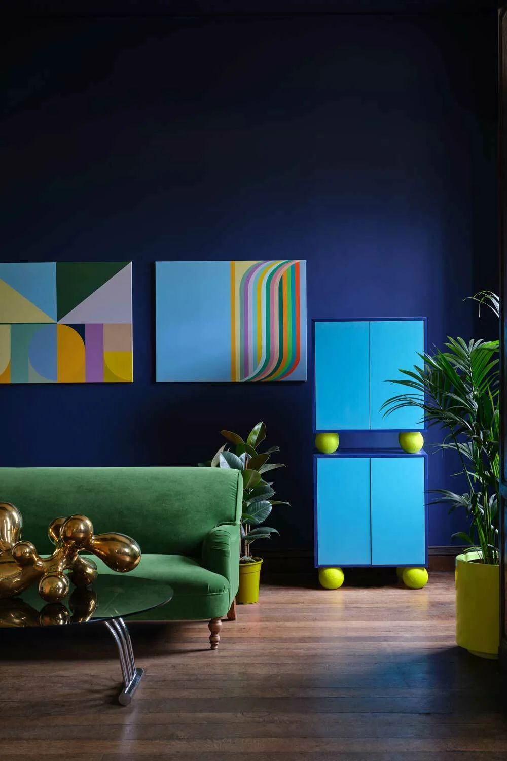
The alternative to combining colors and patterns harmoniously is to choose two complementary colors: orange and blue, pink and green, purple and yellow, etc.

For a more colorful look, use the color wheel to design your palette. Choose a dominant color, which will set the tone, then select the shade located directly to its left or right (or even both!).

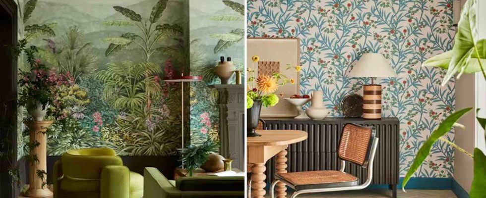
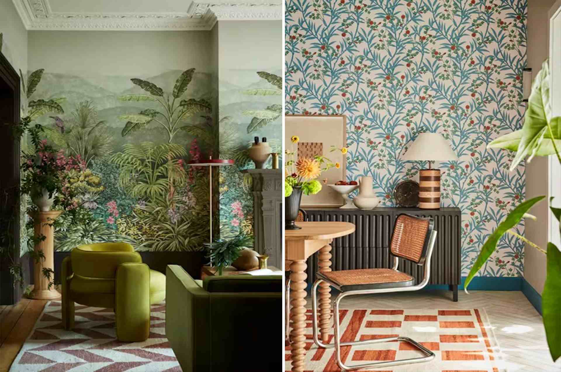
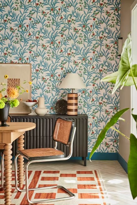
Floral and abyss-inspired patterns are very trendy this year. To avoid visually overloading the decor, play with more sober graphic patterns: stripes, checkers or polka dots, for example. Also use solid colors, for example by combining paint and printed wallpaper.

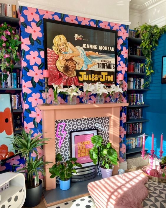
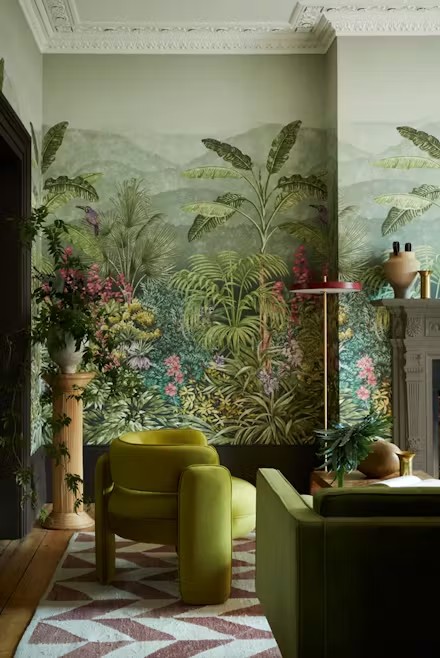
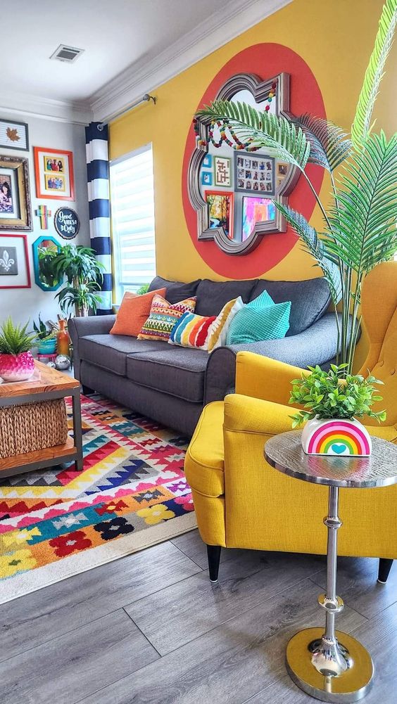
Colors and patterns are a lovely way to highlight the strengths of your interior – remember to play with them! In this very Pop apartment, the patterns, for example, attract all eyes on the fireplace, while the other walls are simply painted.

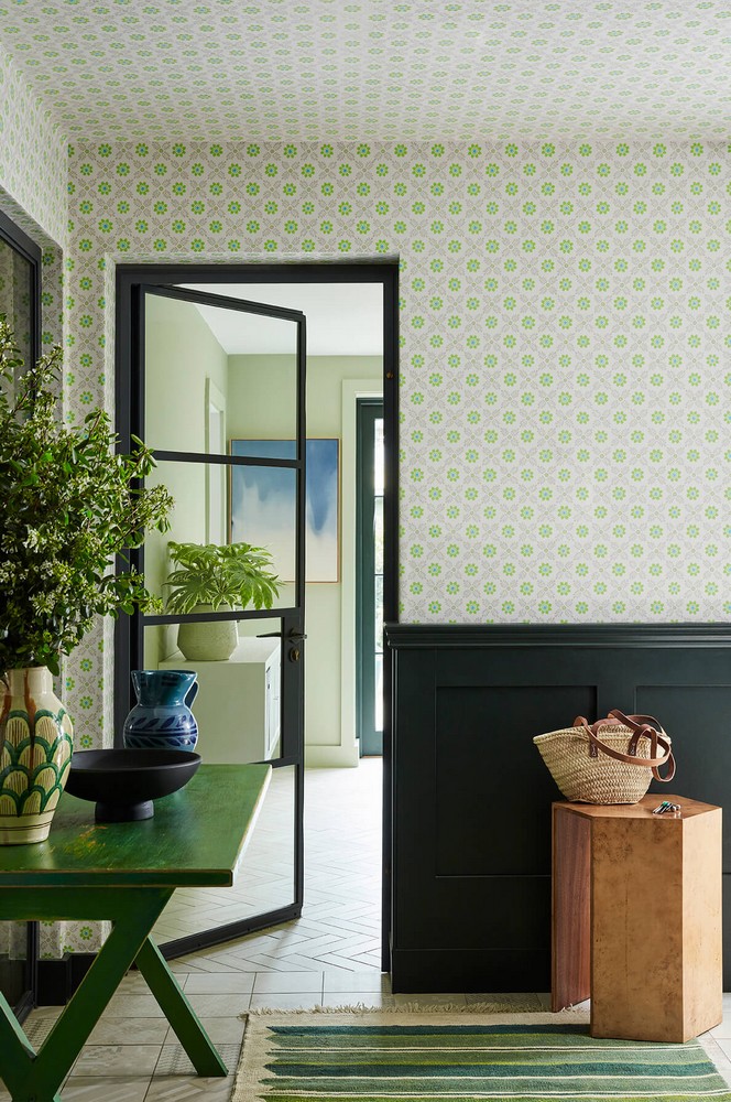
When mixing patterns and colors, we often think first of paint, wallpaper and textiles. Don’t neglect the choice of decorative accessories, for example by choosing a mirror with an original shape, a ceramic decorated with a pattern, or even a kilim rug displaying a relief pattern.
Finally, never lose sight of the fact that when it comes to decor, the rules are meant to be bent. Also, you have every right to be bold and have fun experimenting. It’s even the best way to create a decoration that makes an impression!
Mixing patterns and colors: 5 tips to get you started
You’ve grasped the basics. However, from theory to practice, there is sometimes a difficult step to take! Don’t panic: there are tips to help you.

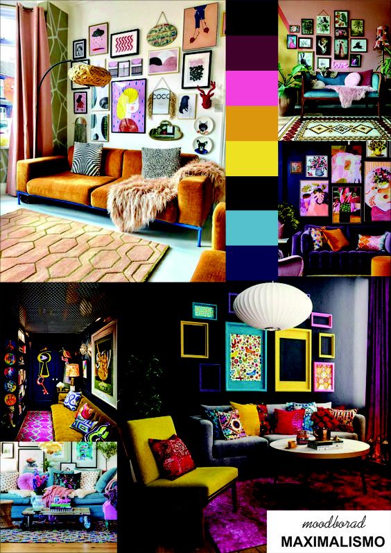
The only truly essential element for revamping your interior by mixing patterns and colors is a common thread. Having a strong bias is indeed an excellent guarantee of successful decorating. Take the time to create a mood board (or inspiration board) on Pinterest, or by making a traditional collage.

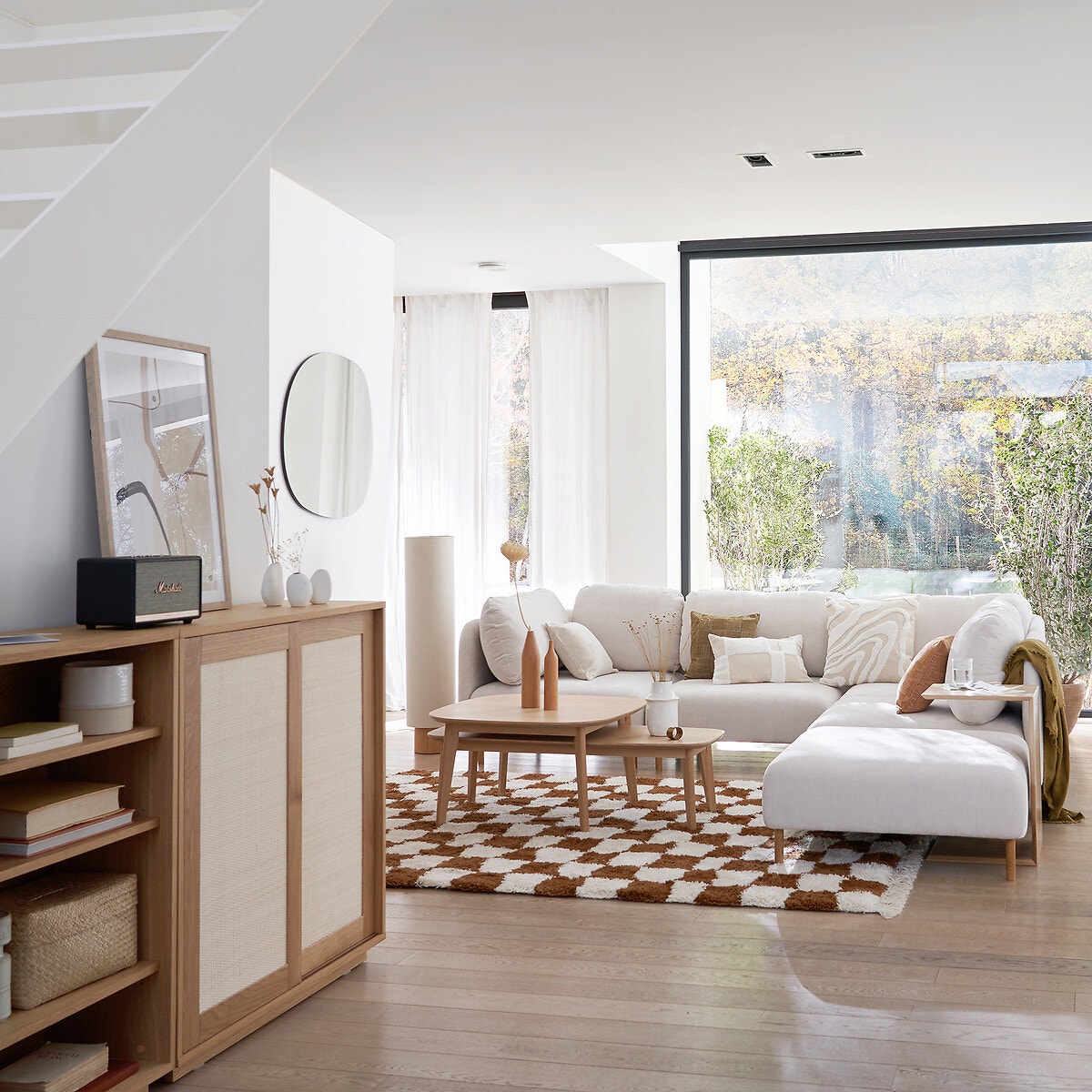
Certainly, maximalism is in the spotlight this year. But nothing stops you from opting for a more sober look, by combining two neutral shades, and replacing the prints with more subtle options – like tufted cushions.

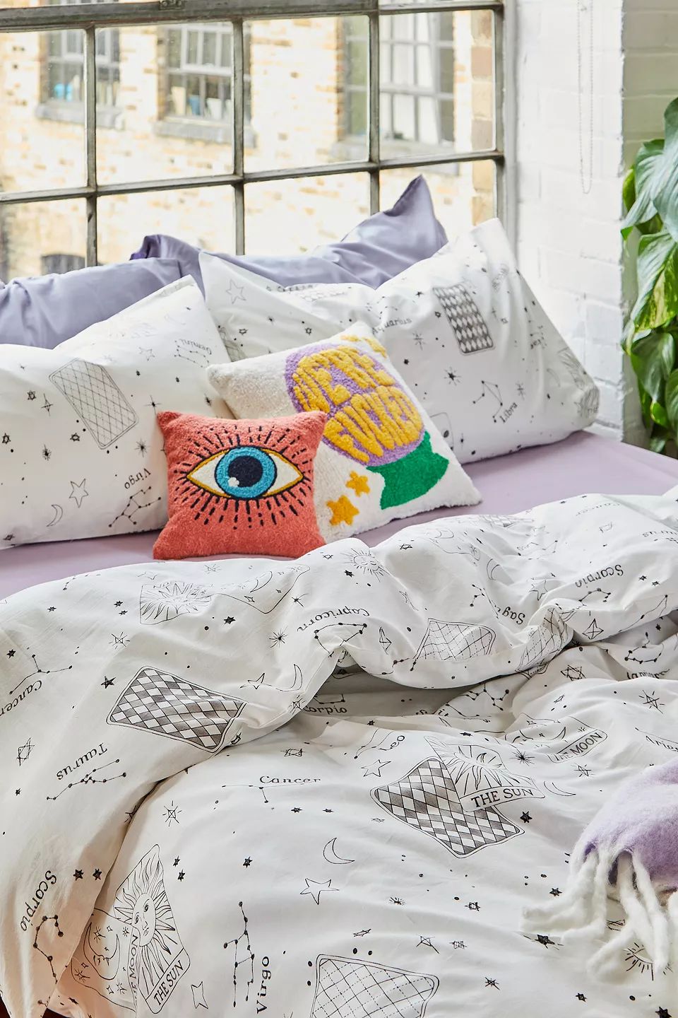
If you are really afraid of missing out, practice, for example, by putting together your own bedding set. That’s good: mix and match is super trendy! For example, combine a printed duvet with plain pieces, and add a few cushions: it’s a great way to get your hands dirty!

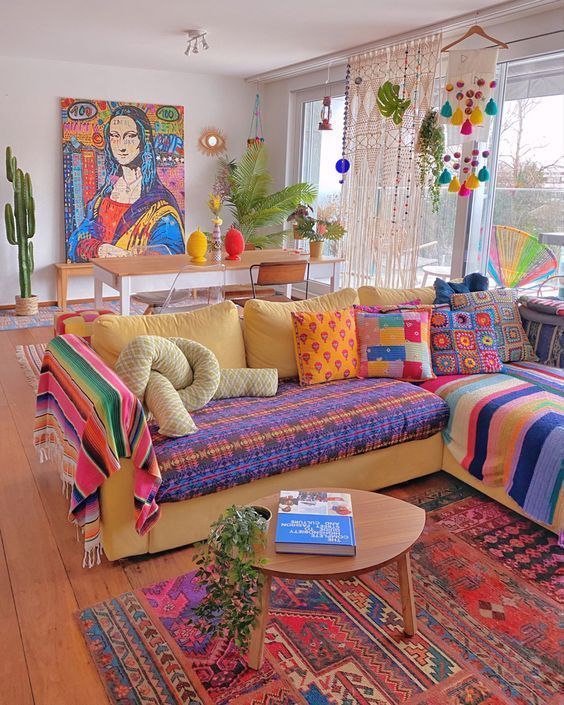
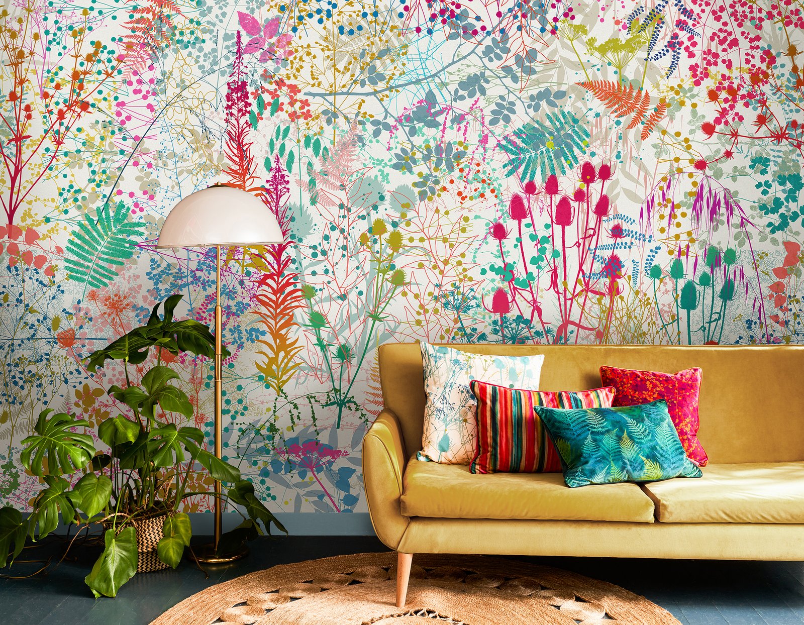
The living room is another interesting playground to try mixing colors and patterns in the decor. Before you go ahead and repaint and (or!) wallpaper the walls, you can have fun with wall decoration: wall hangings, posters, works of art, etc. As for the sofa, we have fun as always with the rug and the cushions.
Depending on its configuration, you can also have fun dressing it up using throws or diverting a fouta. So many elements that are easy to rearrange, replace or eliminate if the final result is not satisfactory!

Are you struggling to compose your mood board? Or are you worried about not finding the paint that matches your wallpaper perfectly? Turn to color editors. These specialists generally offer the shades of their wallpapers in a rather complete range of colors.
Some even offer you complete harmonies to inspire you. It’s actually quite smart to take a look at it to create your moodboard!